Abstraction
Abstract photography, sometimes called non-objective, experimental, conceptual or concrete photography, is a means of depicting a visual image that does not have an immediate association with the object world and that has been created through the use of photographic equipment, processes or materials.
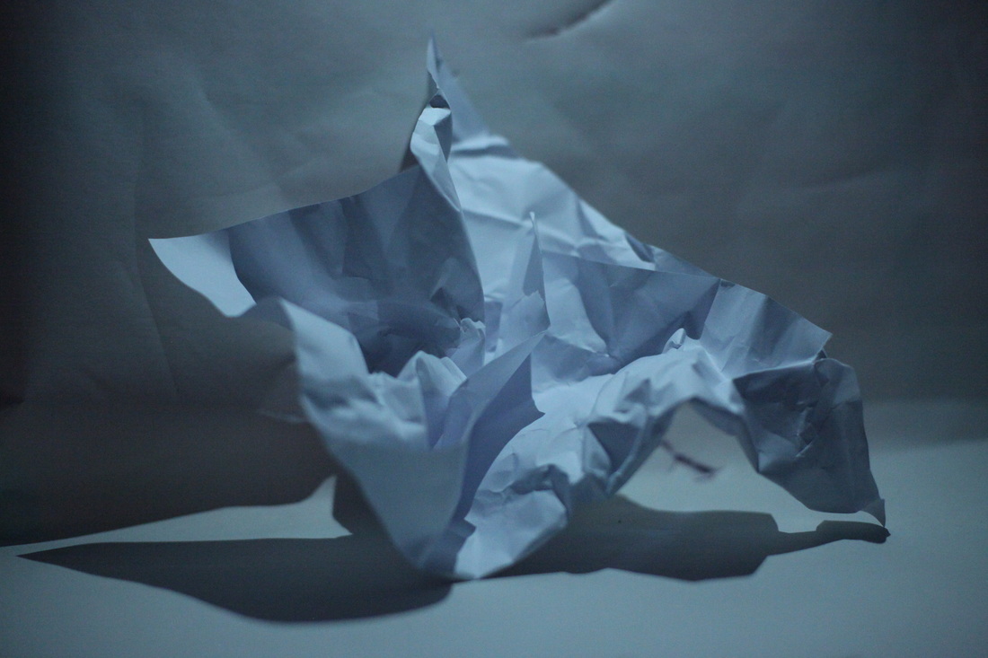
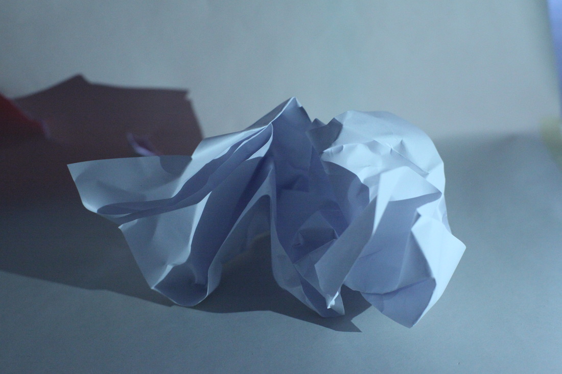
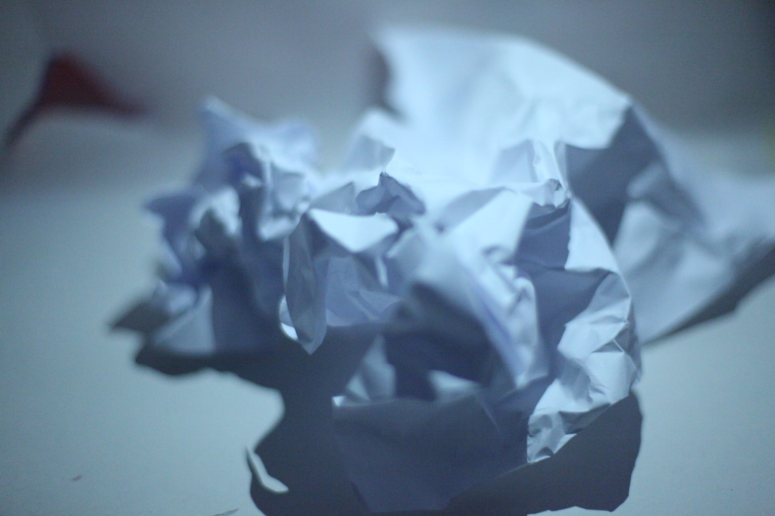
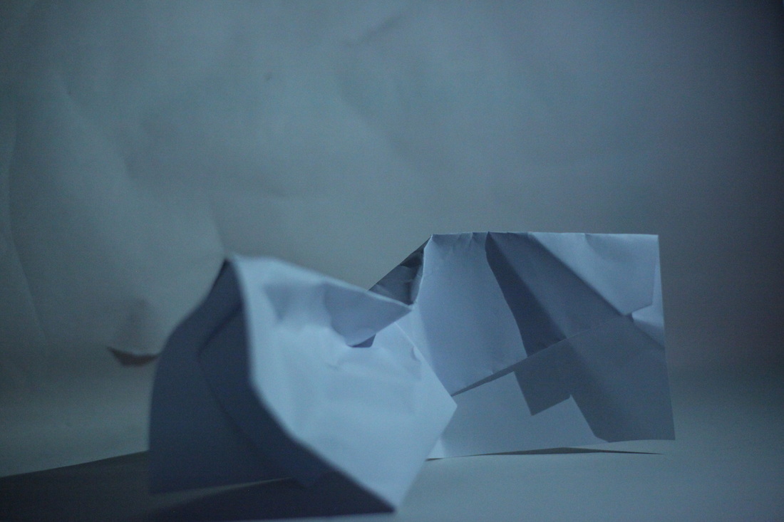
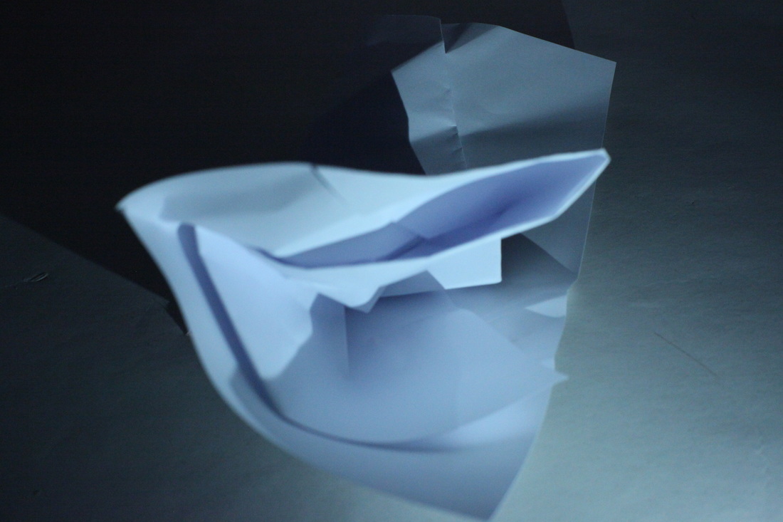
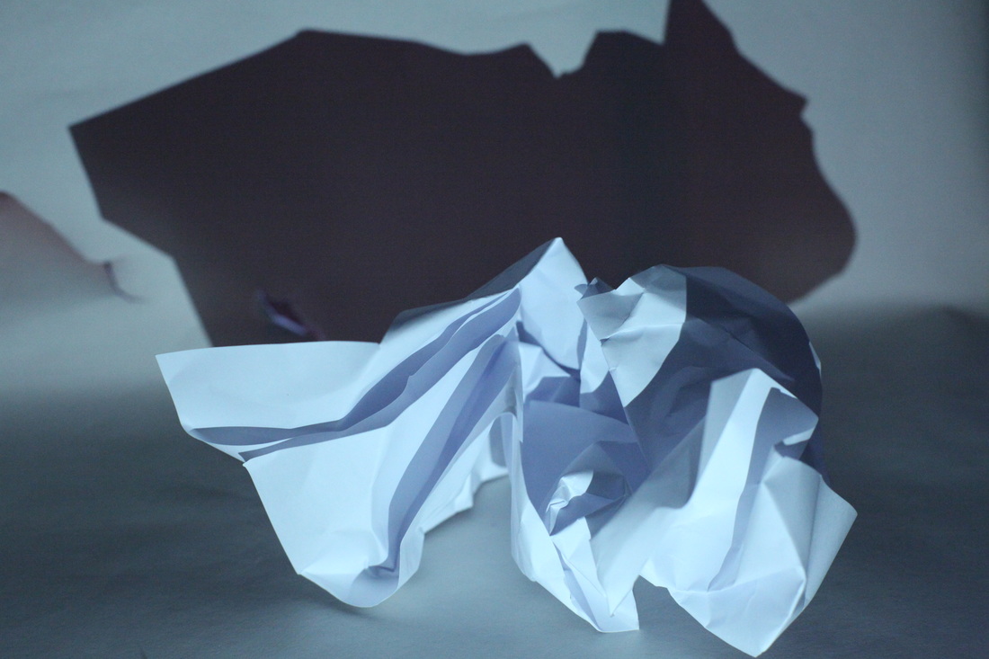
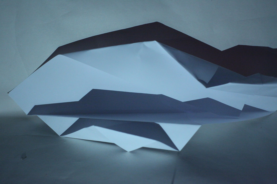
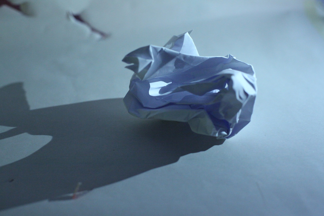
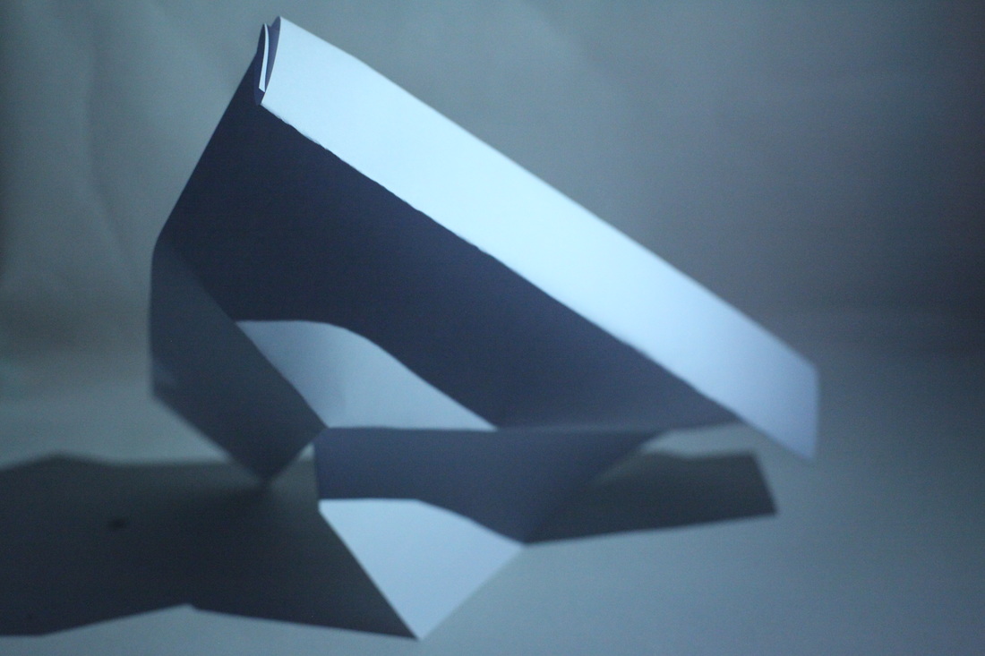
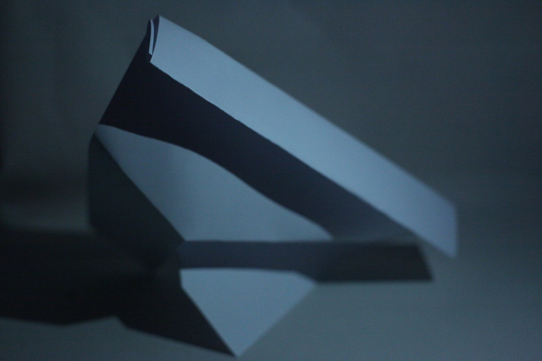
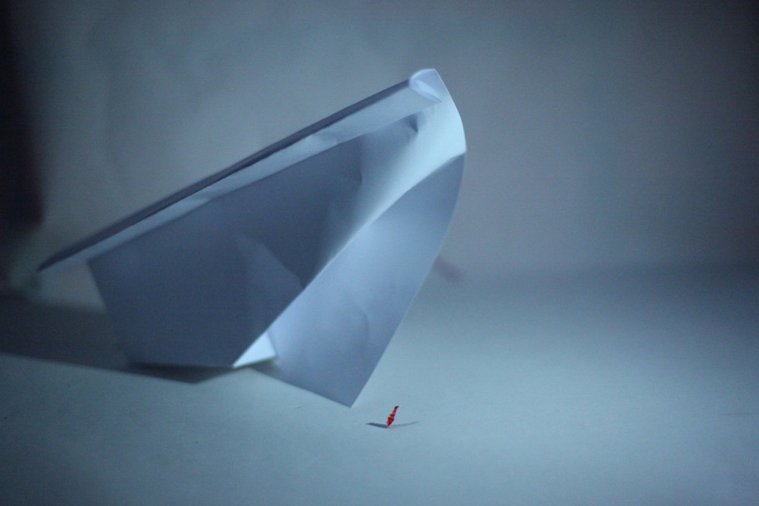
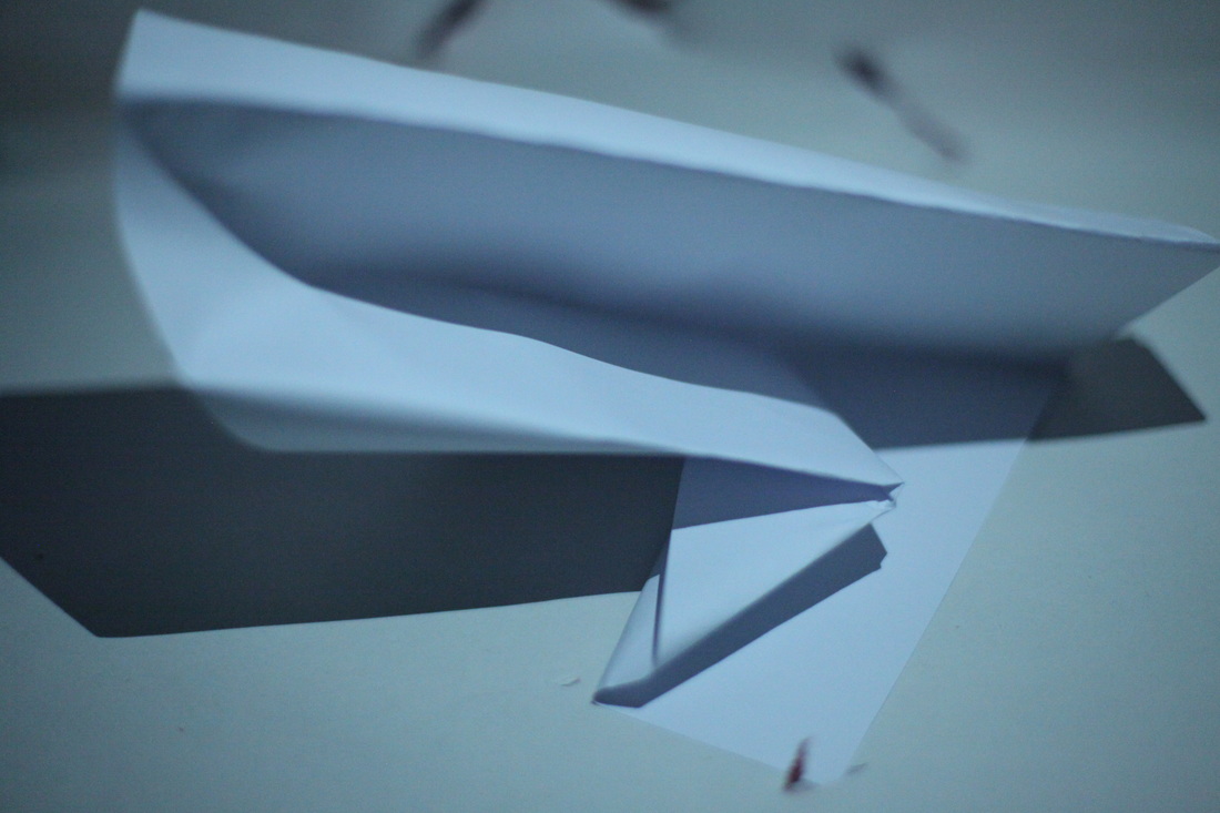
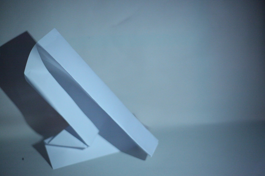
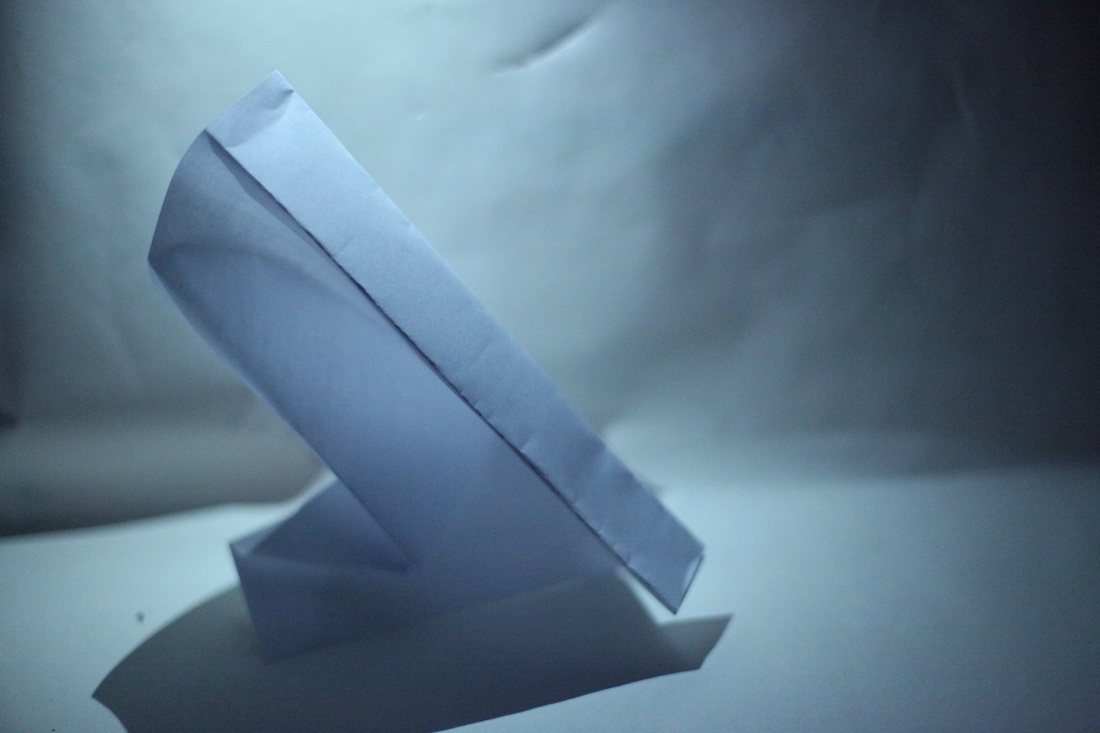
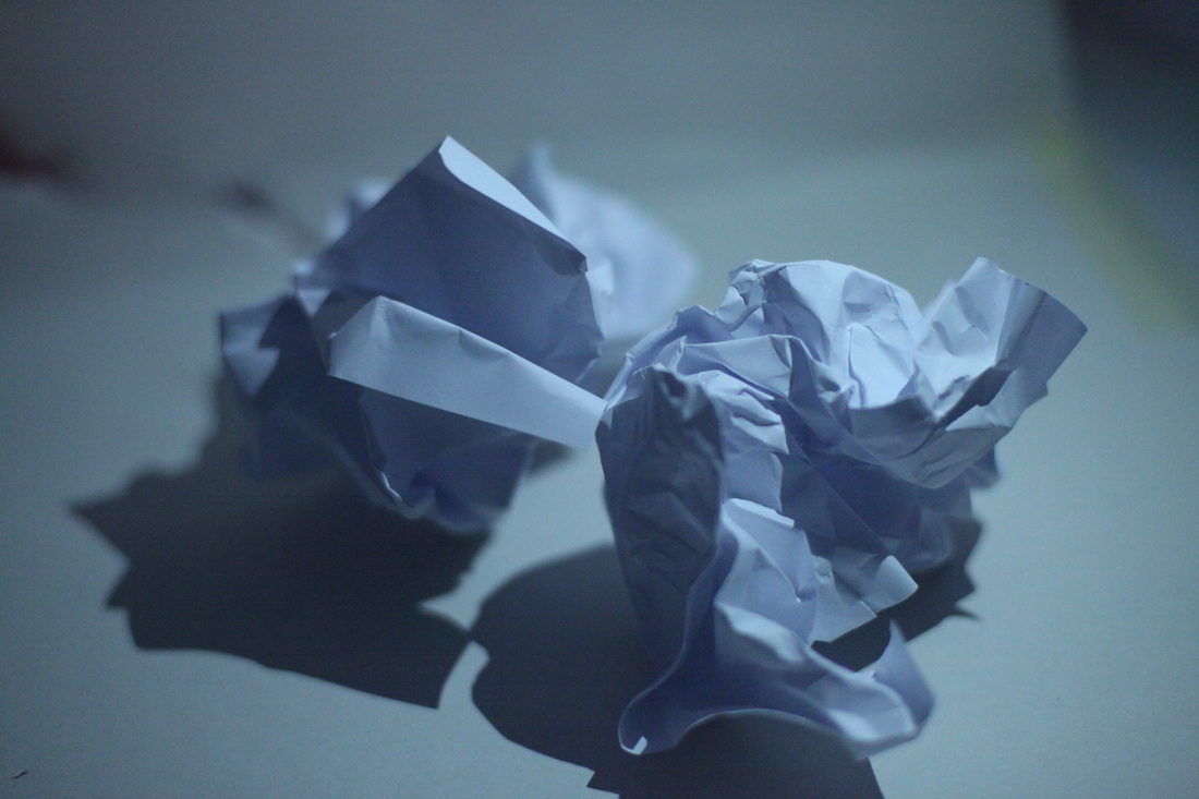
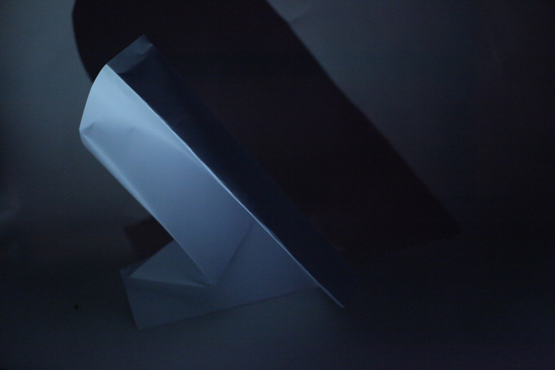
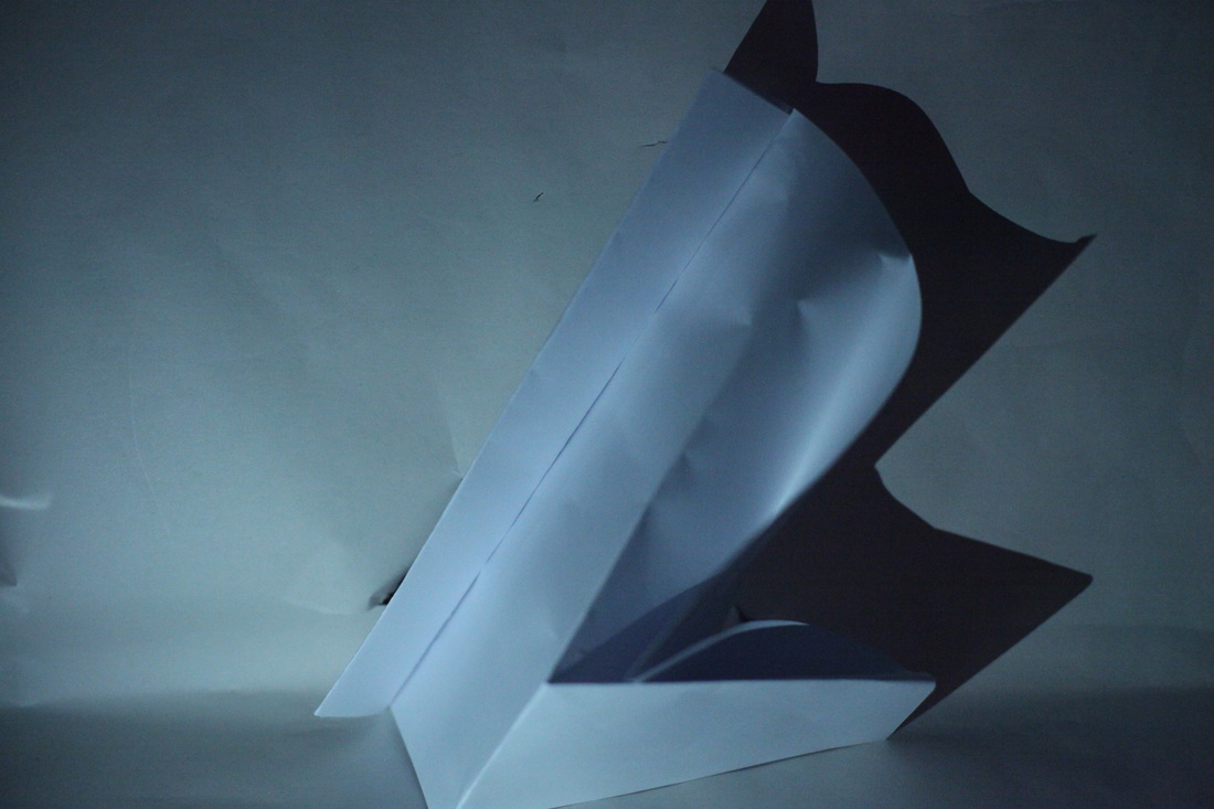
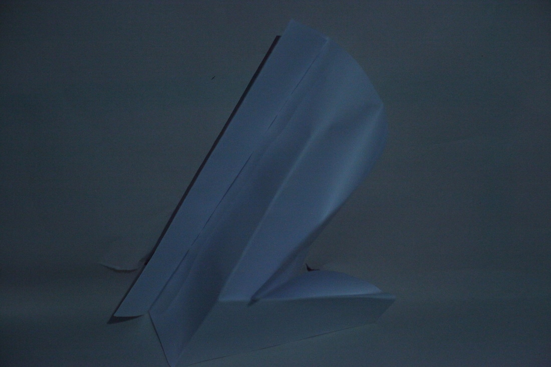
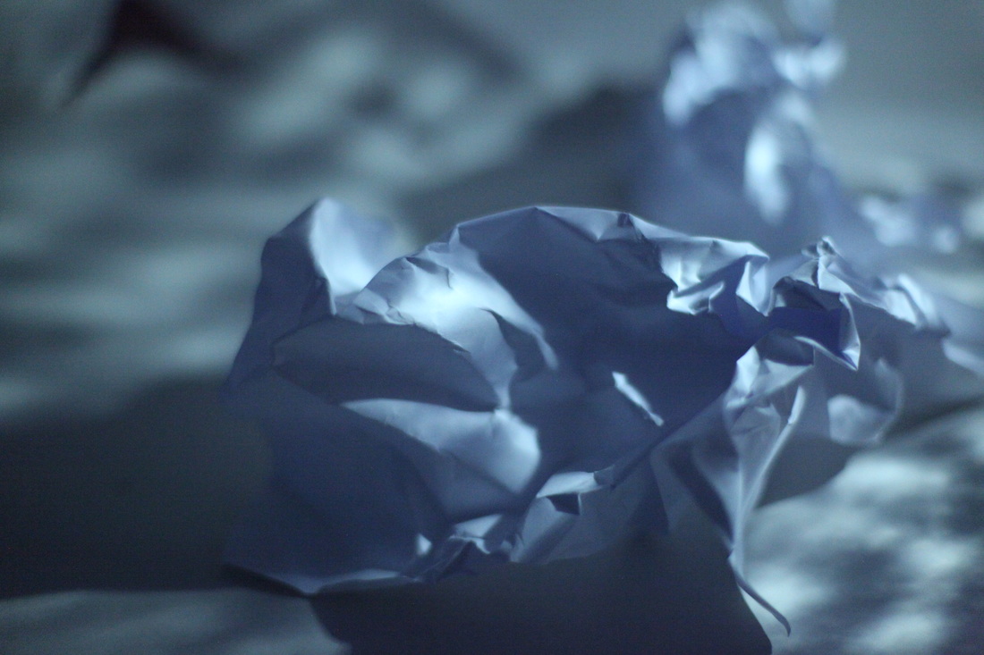
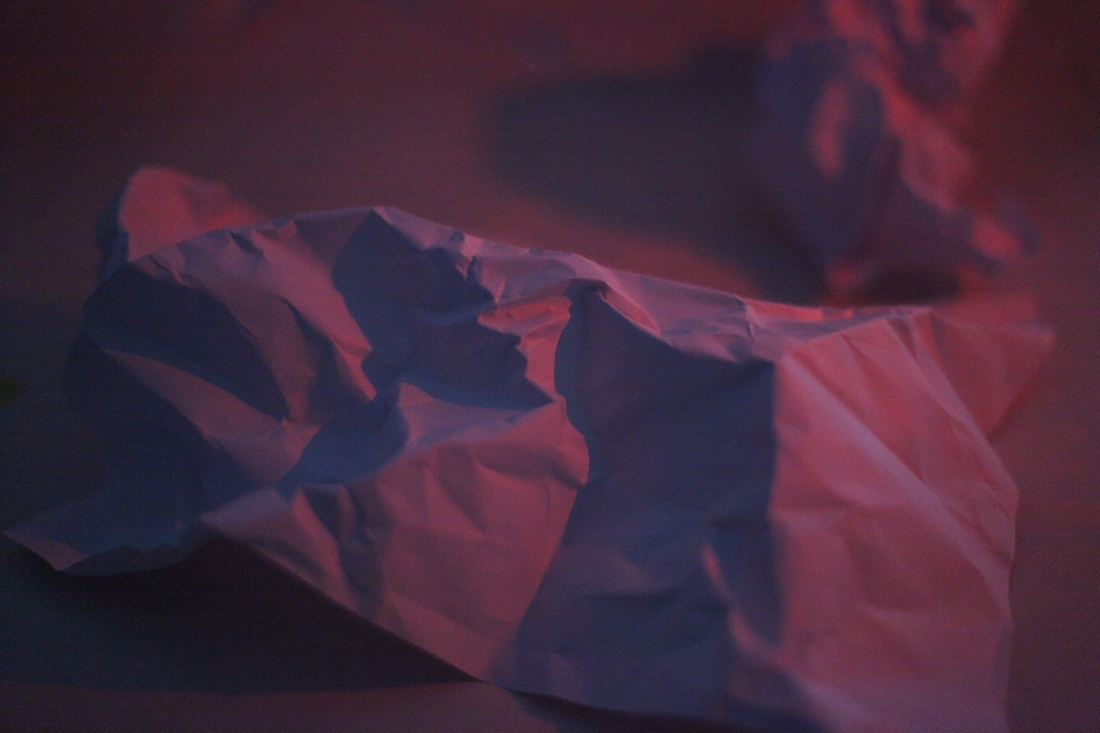
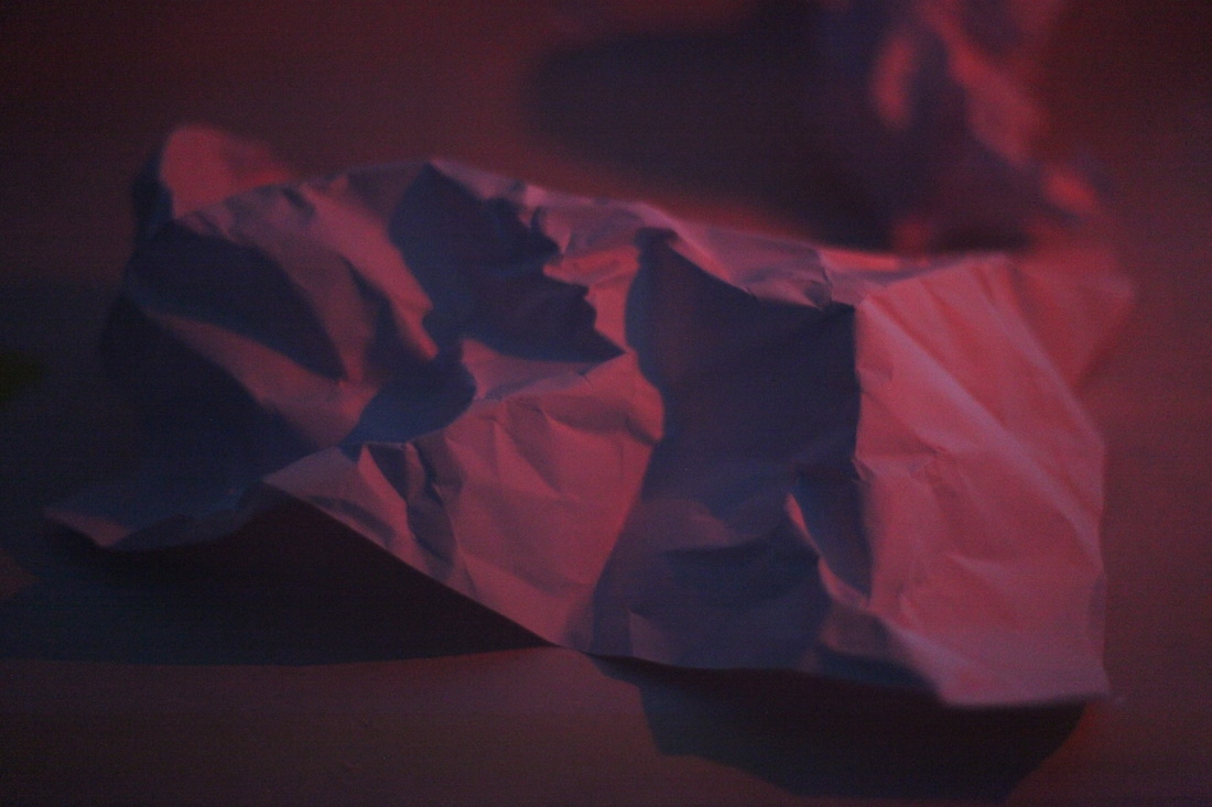
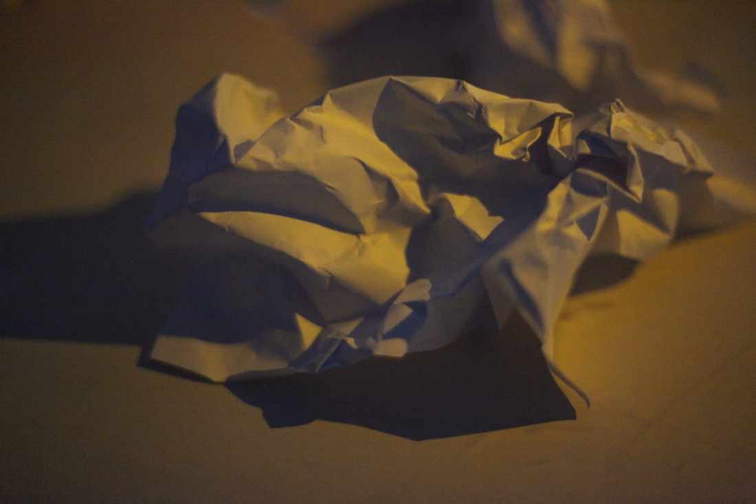
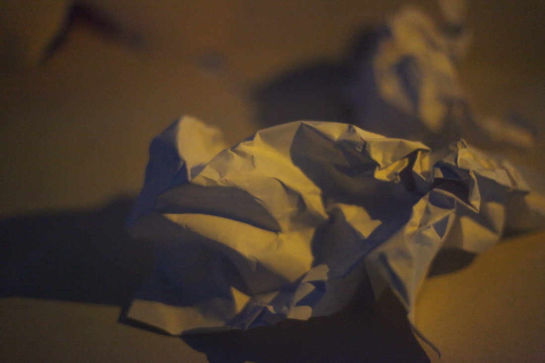
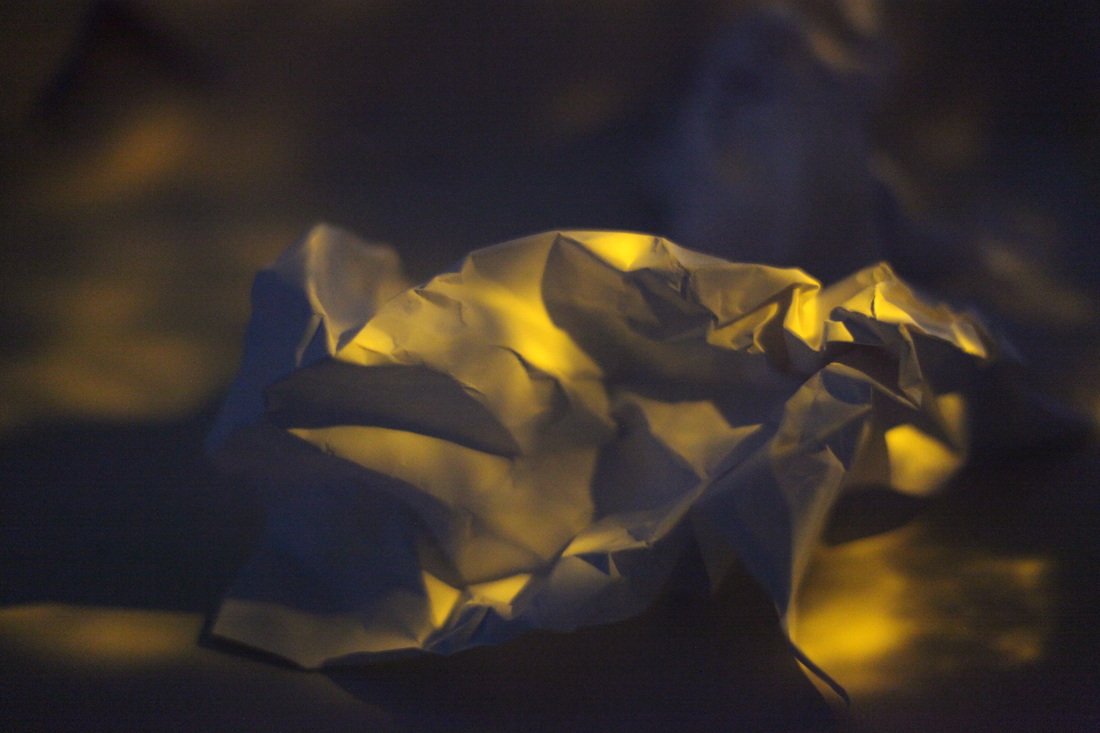
White paper test
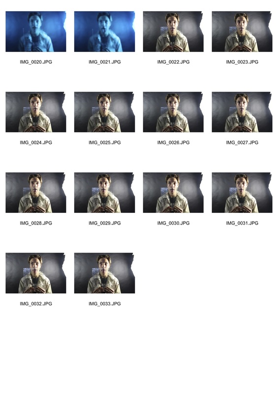
For this task I made 24 unique photographs of pieces of paper. I was not allowed to rip or tear the paper but I did fold and crumple it for different abstract photographs. These were shot on a white background and lit with spotlights and occasionally my phone torch. I changed the lighting and shapes of the the paper for each photo and I also played with different coloured lighting by holding a coloured filter over the light.
WWW - I managed to get images of paper in many different folded postion and pictures from different angles. There is also a large variety of photos with different lighting.
EBI -I could have taken more photos with coloured lighting, instead of just 5 with red and yellow light.
WWW - I managed to get images of paper in many different folded postion and pictures from different angles. There is also a large variety of photos with different lighting.
EBI -I could have taken more photos with coloured lighting, instead of just 5 with red and yellow light.
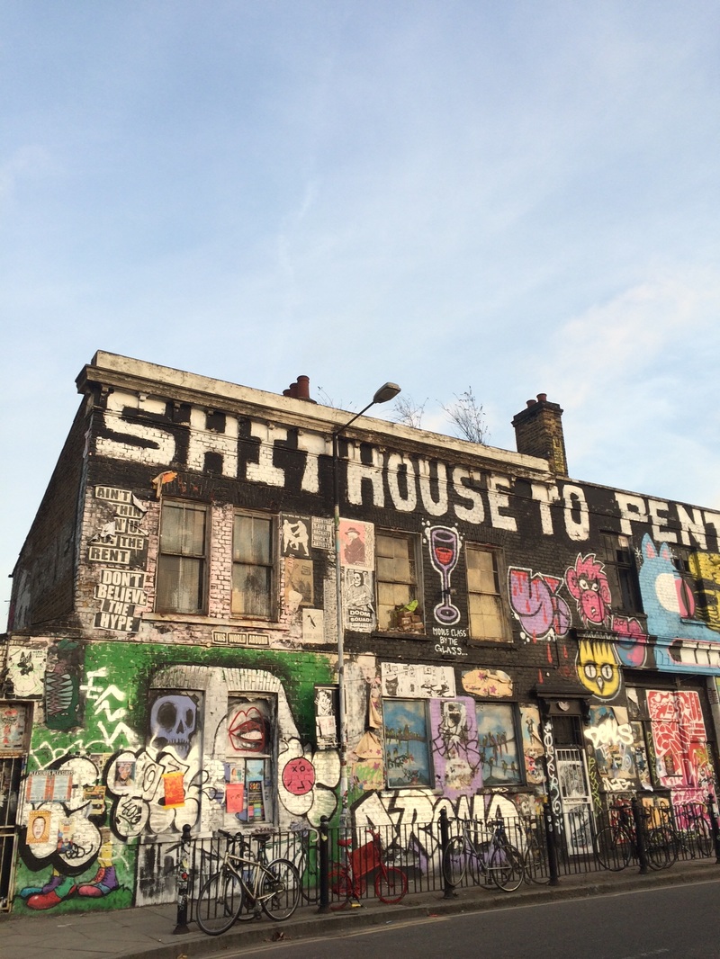
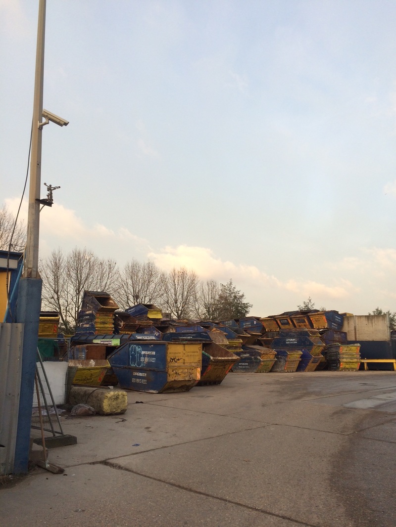
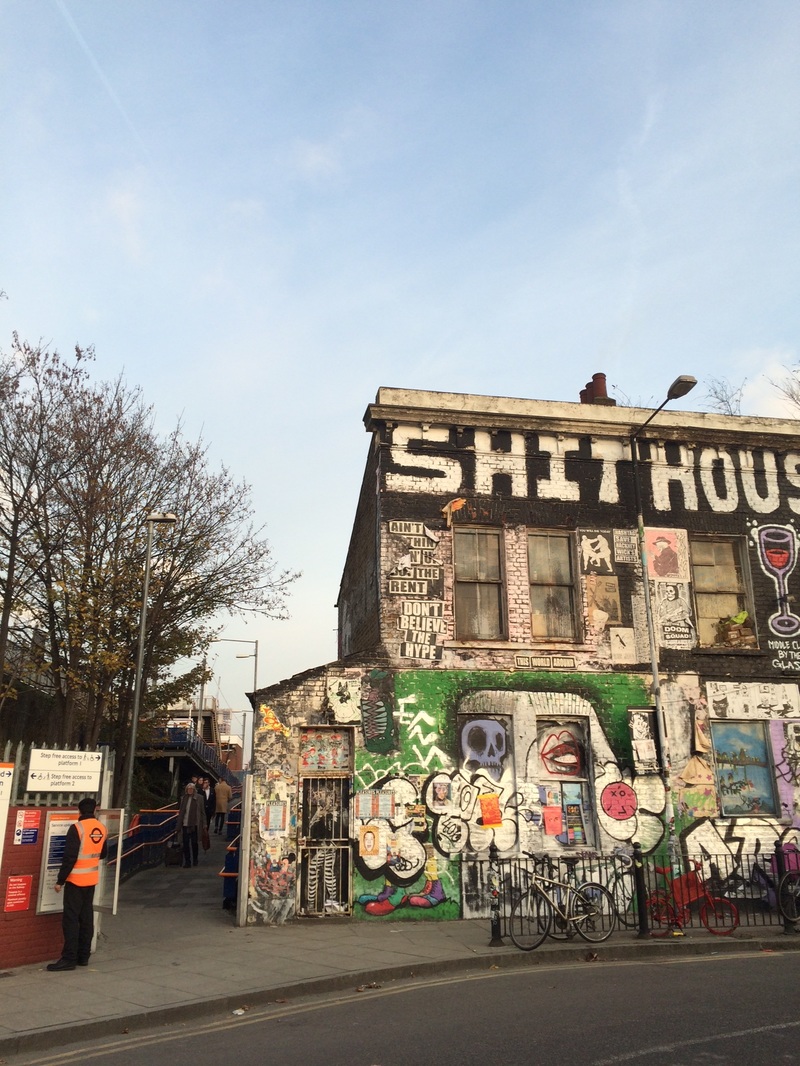
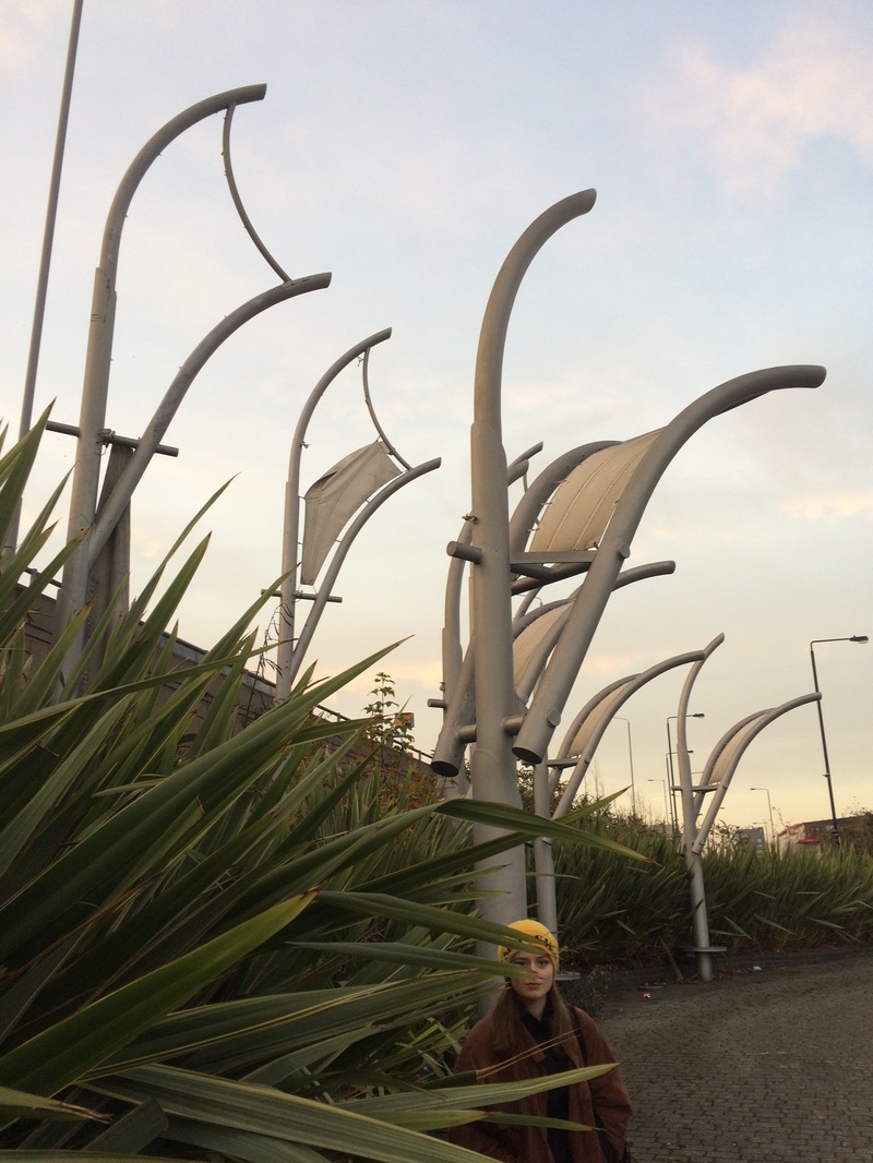
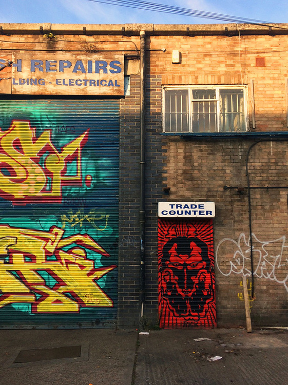
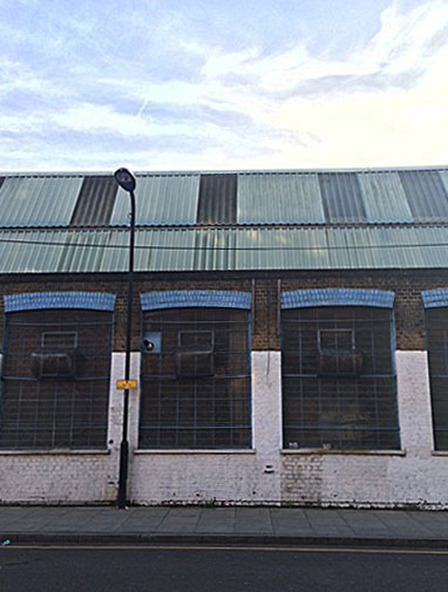
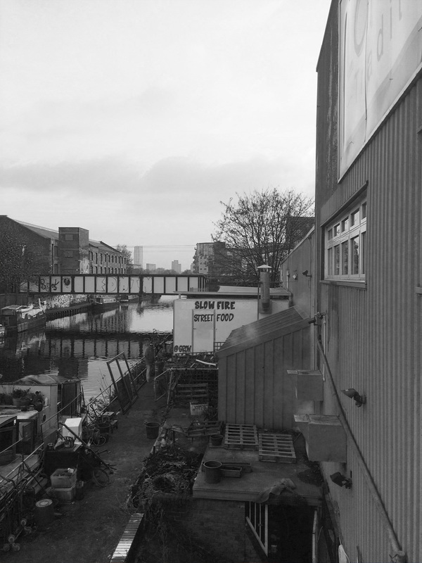
Abstract Photos - Peckham Savage Yard
Here are some abstract photographs I took for homework with my friends in Peckham. We visited the Bussey building fora thrift sale and decided to take photos in and around the building. Most of these were taken around a large salvage yard, some in a building and some in a carpark. I am particularly fond of the clean and white aesthetics in the building and the car park.
WWW - large variey of locations and I think I managed to experiment with different types of abstract photos, with different lighting and levels of zoom.
EBI - some of the photos here aren't entirely abstract, so I should concentrate on taking exclusively abstract photos next time.
EBI - some of the photos here aren't entirely abstract, so I should concentrate on taking exclusively abstract photos next time.
Abstraction Experiments - accetate
For this abstraction experiment I took a black and white print on paper and painted on it.
Original photo
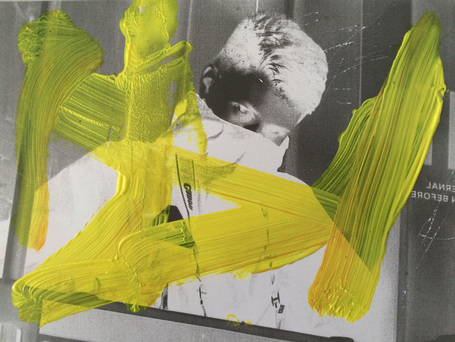
I made a negative print of the original photo in a dark room. I painted over it and used my keys to scratch the photo.
|
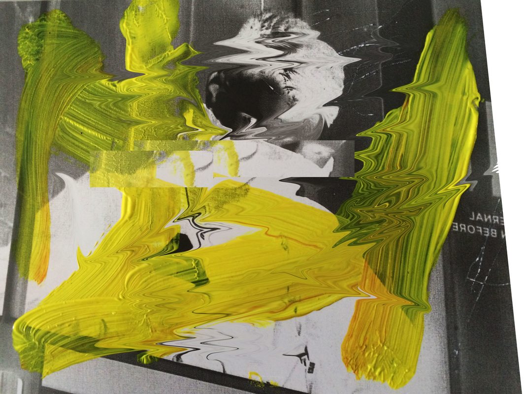
For this photo I used the previous negative print and utilised the "liquify" option on photoshop to create a blurry, watery effect. I also tilted the image backwards slightly. Lastly, I decreased the brightness and increased the contrast.
|
|
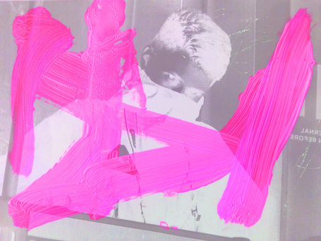
This time I decreased the hue of the negative print on photoshop, but increased the saturation and lightness. This resulted in the paint becoming neon pink.
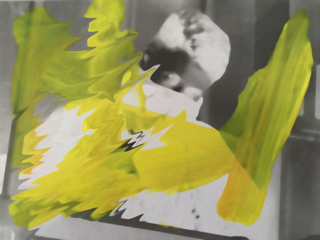
For this photo I used the dust and scratches option and adjusted the levels until it is relatively blurry. I then used liquify again, but only on the left side of the photo.
This time I used the original photo. I selected some areas of the image and changed the colours to blue and red. For the central part of the photo I selected the filter "chrome" to create a metallic effect.
I edited the previous photo by pixelating a part of the photo and changing the brightness of another part of the photo. I then liquified almost the entirety of the photo. This effect works especially well with the pixelated part of the photo.
for this photo I took the first edit and simply used the "blur" effect. Afterwards I solarized it to change the colours.
WWW - The photoshopped images contained a lot of different effects and colours. This made each image unique and interesting.
EBI - I could have done experiments with the accetate image in the dark room, such as bleaching.
EBI - I could have done experiments with the accetate image in the dark room, such as bleaching.
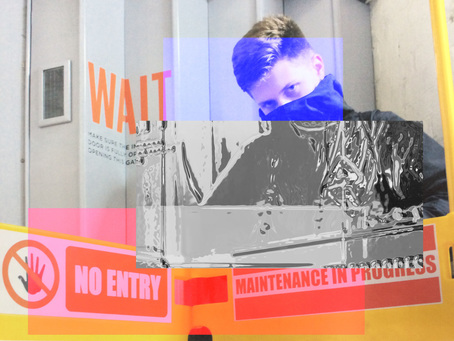
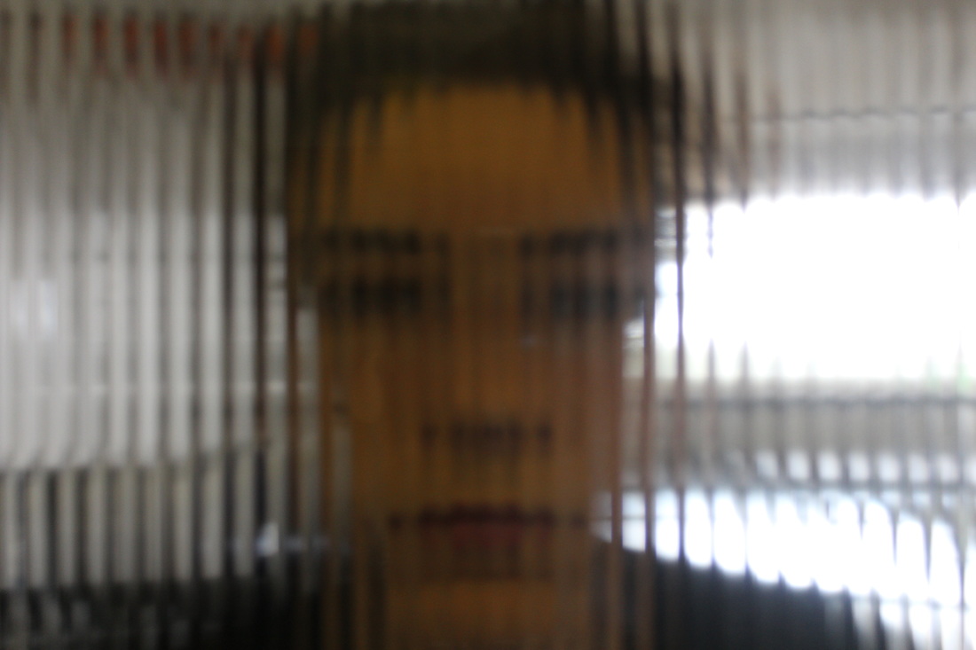
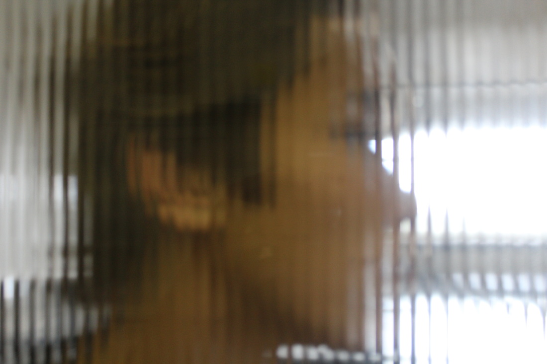
Abstract Portraits Contact Sheet
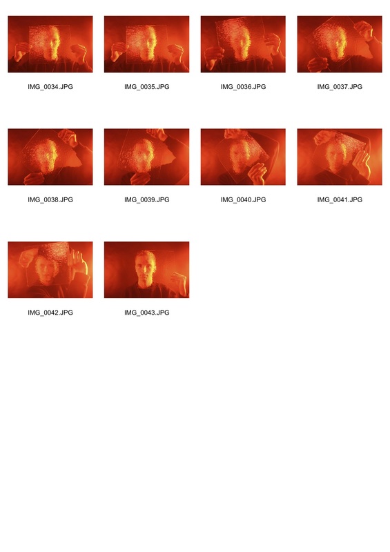
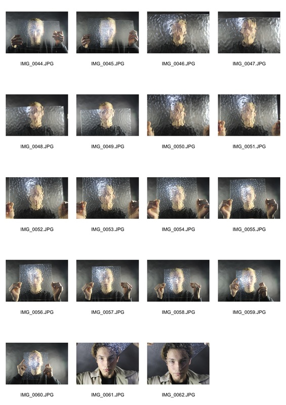
For these potraits I aimed to replicate the work of Bill Jacobson. I shot potraits of people through bumpy panes of glass to create an abstract defocused feel to the images. I changed the blurriness by telling the subjects in the photo to move the glass either away from or closer to them, as well as zooming in the camera lense. I used coloured acetate paper to create atmosphere by holding it over a light.
Bill Jacobson
|
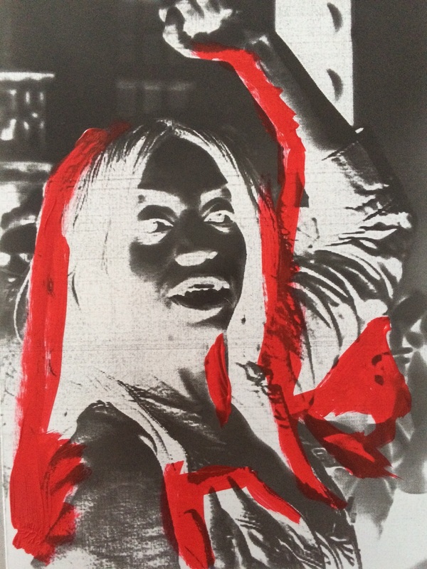
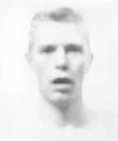
Bill Jacobson is known for his ‘defocused’ monochromic images, and they defined his success as a photographer. They were inspired, in part, by the artist’s fascination for early twentieth-century photography and the blurred or obscured subjects of the medium’s early pioneers. Collecting anonymous old snapshots at flea markets, Jacobson was interested in the ‘layers of time’ that these photographs revealed, and by their ability to transport the viewer back to the precise moment of their making, when the people, their lives and their surroundings were ‘current’. His photos also reflected his preoccupation with loss and mortality in the early 1990s; themes closely tied to his observations of the AIDS epidemic. The faces are hard to grasp, difficult to discern as they recede into the white field of the photograph.
The photos below are my responses. |
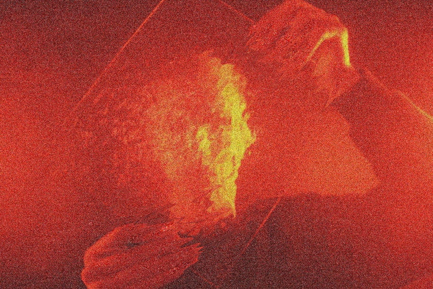
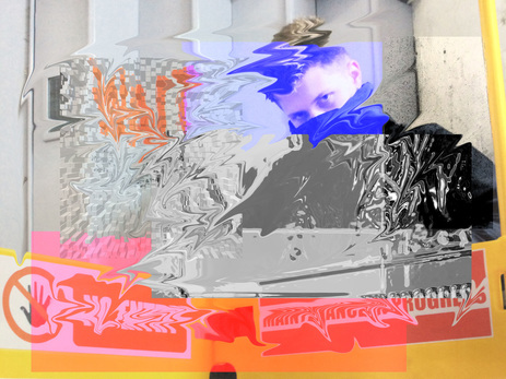
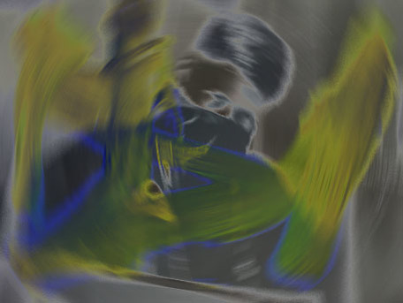
In order to add to the confusion and blurriness created by the bumpy mirror, I turned up the grainy effects on photoshop for the desired effect. The red lighting also creates a sinister mood and brghtens the right side of the of the subject's face, creating a contrasts with the dark clothing.
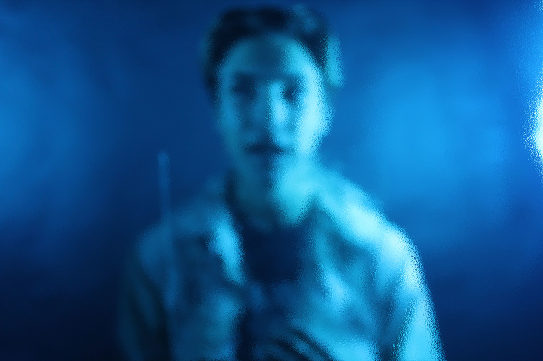
I blurred the photo because I thought it would go well with the already out of focus image. This is particularly authentic to Bill Jacobson's defocused images.
WWW - I am very proud of the final two images and I love the colours and lighting.
EBI - one of the final images should have been a close up defocused image instead of mid-zoom.
WWW - I am very proud of the final two images and I love the colours and lighting.
EBI - one of the final images should have been a close up defocused image instead of mid-zoom.
Erwin Blumenfeld
Erwin Blumenfeld, regarded as one of the most influential photographers of the twentieth century. An experimenter and innovator, he produced an extensive body of work throughout his thirty-five year career including black and white portraits and nudes, celebrity portraiture, advertising campaigns and his renowned fashion photography. Born in Berlin in 1897, Blumenfeld drew early inspiration from the Dadaists, incorporating experimental techniques like solarization, multiple exposures, and photomontage into his darkroom practice
The photos below are my responses.
The photos below are my responses.
WWW - I think the levels of contrasts in the photos are succesful and the different angles also provides variety.
EBI - the lighting made it difficult to get more focused images. However, I think the defocused images improves the photos, much like the Bill Jacobson responses.
EBI - the lighting made it difficult to get more focused images. However, I think the defocused images improves the photos, much like the Bill Jacobson responses.
Saul Leiter
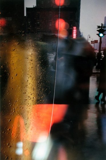
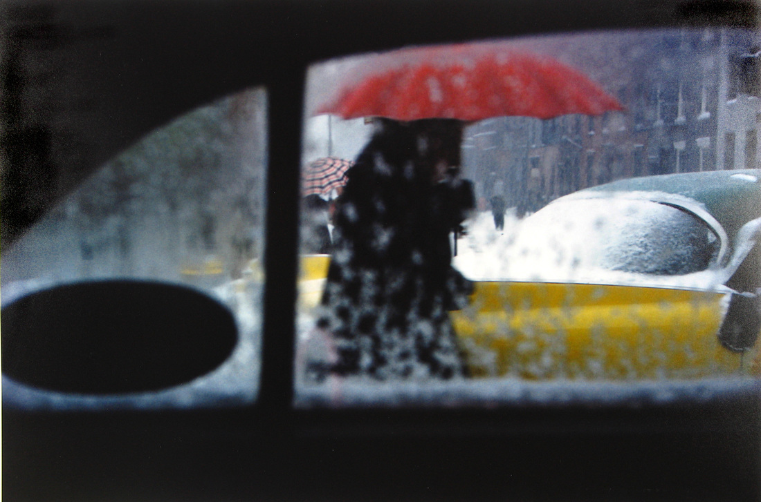
Since he first arrived in New York, Leiter had been documenting street life in black and white, intriguing the eye with his use of obstructions, blurred movement and half-concealed details. In 1992, his work came to the attention of the curator Jane Livingston, who included him in her “New York School”: a group of noteworthy midcentury photographers, including Robert Frank and Diane Arbus, with a film noirish vision of the city.
Leiter was also a pioneer of color photography: He developed a distinctive, dreamy style that played with shallow depths of field and a vibrant palette
Erb argues that these images are closely related to his love of painting. “You can see influences of abstract expressionism in his color work,”
The contact sheet below is my response.
WWW -I managed to incorporate the rain into the photos, creating an authentic feel. Most of the photos are also shot through glass panes which is also authentic
EBI - The backgrounds of the photos aren't defocused enough. There is also a lack of depth with some of the photos.
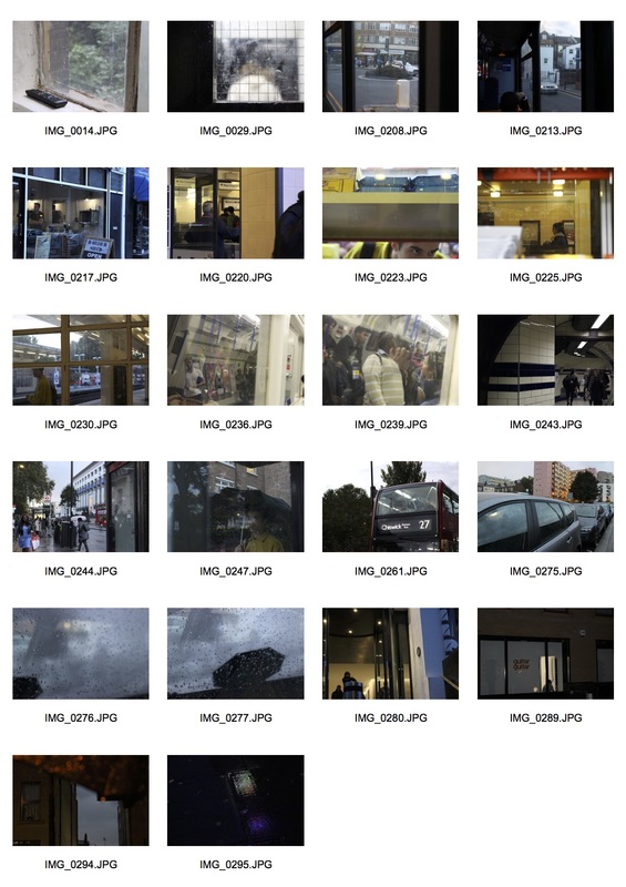
I visited areas around Mornington Crescent while it was raining to replicate the two pictures above, with raindrops on the window and creating an abstract, blurry feel shooting through the window. I also took two photos while it was dark to add atmosphere, which is different from the Saul Leiter examples above, but I believe that it fits the style of the artist. I took many photos through the glass of cars and shop windows to replicate his style was well. This included the windows of bus stops and the tube, which shows snippets of everyday city life, another trademark of Saul Leiter's style.
Three Strands
First strand - Tony Sweet
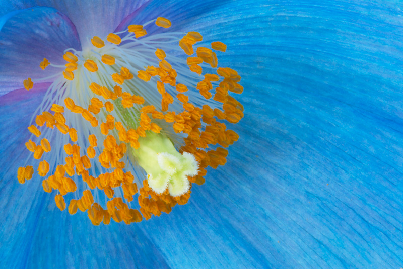
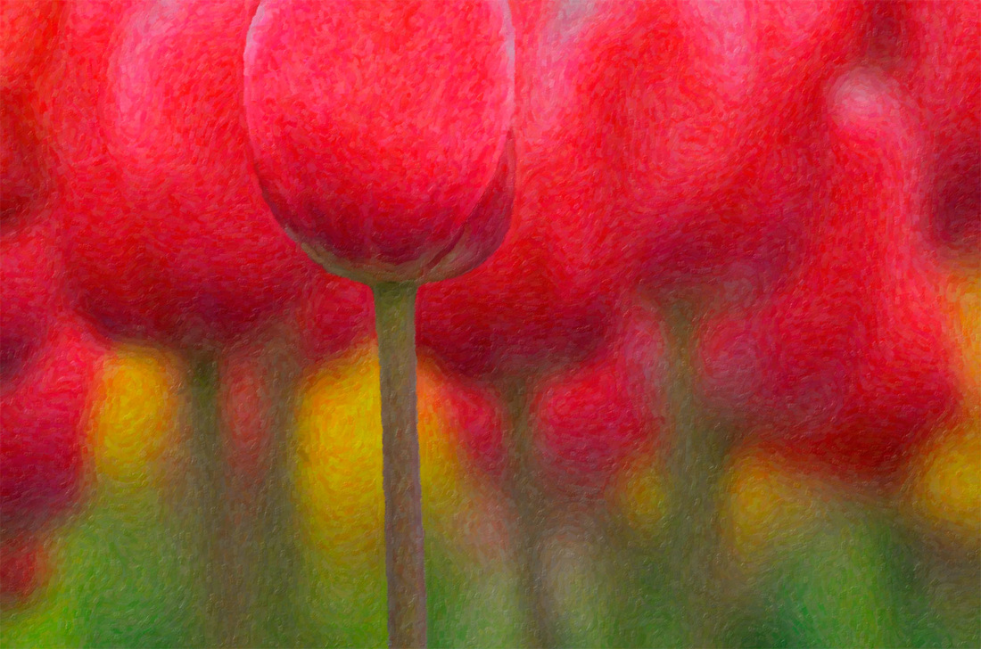
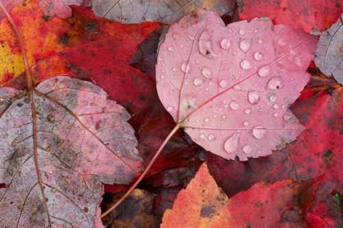
Concept - For this strand I will take close-up photos of nature, especially flowers and leaves, ad try get the most colourful images possible.
Tony is a Nikon Legend Behind the Lens.
After successful careers as a jazz musician/ educator, and professional magician, Tony settled on photography as his chosen means for personal expression. Beginning as a film photographer, Tony has become facile in image editing software and plugins and is an in-demand speaker throughout the United States and Canada on creativity in the digital age. His abstract photos are often nature oriented, full of bright colours.
After successful careers as a jazz musician/ educator, and professional magician, Tony settled on photography as his chosen means for personal expression. Beginning as a film photographer, Tony has become facile in image editing software and plugins and is an in-demand speaker throughout the United States and Canada on creativity in the digital age. His abstract photos are often nature oriented, full of bright colours.
My response
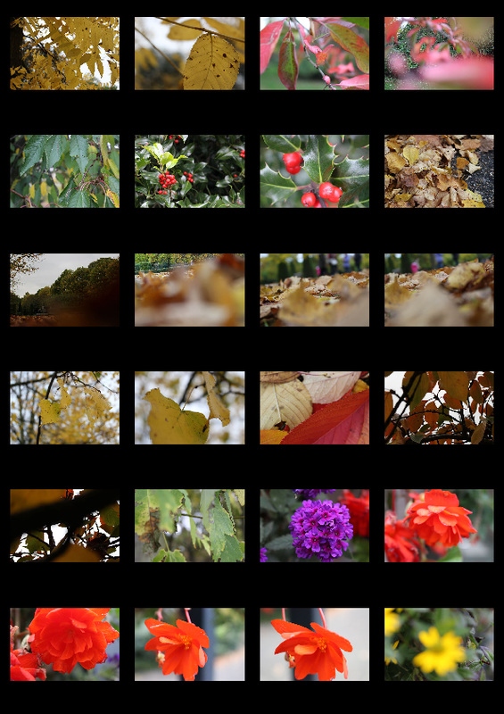
WWW - variety of angles and zoom.
EBI - even though I took pictures of different coloured flowers and plants, there could still be a greater variety of colours.
EBI - even though I took pictures of different coloured flowers and plants, there could still be a greater variety of colours.
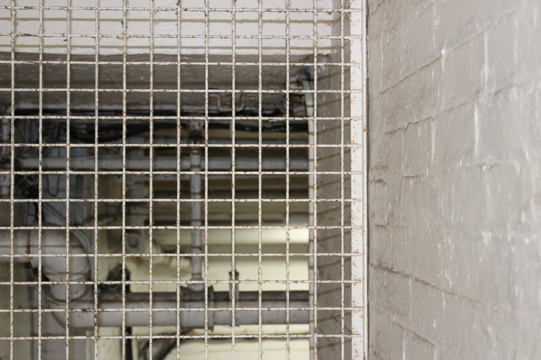
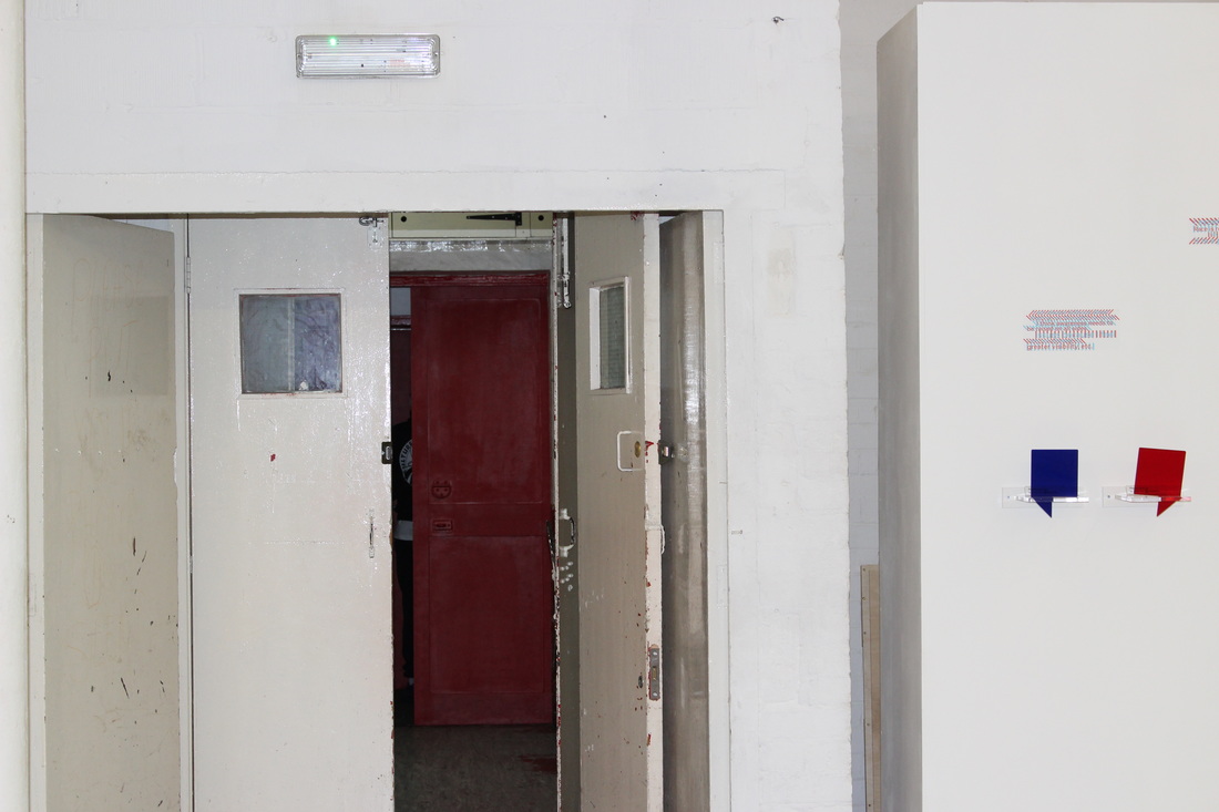
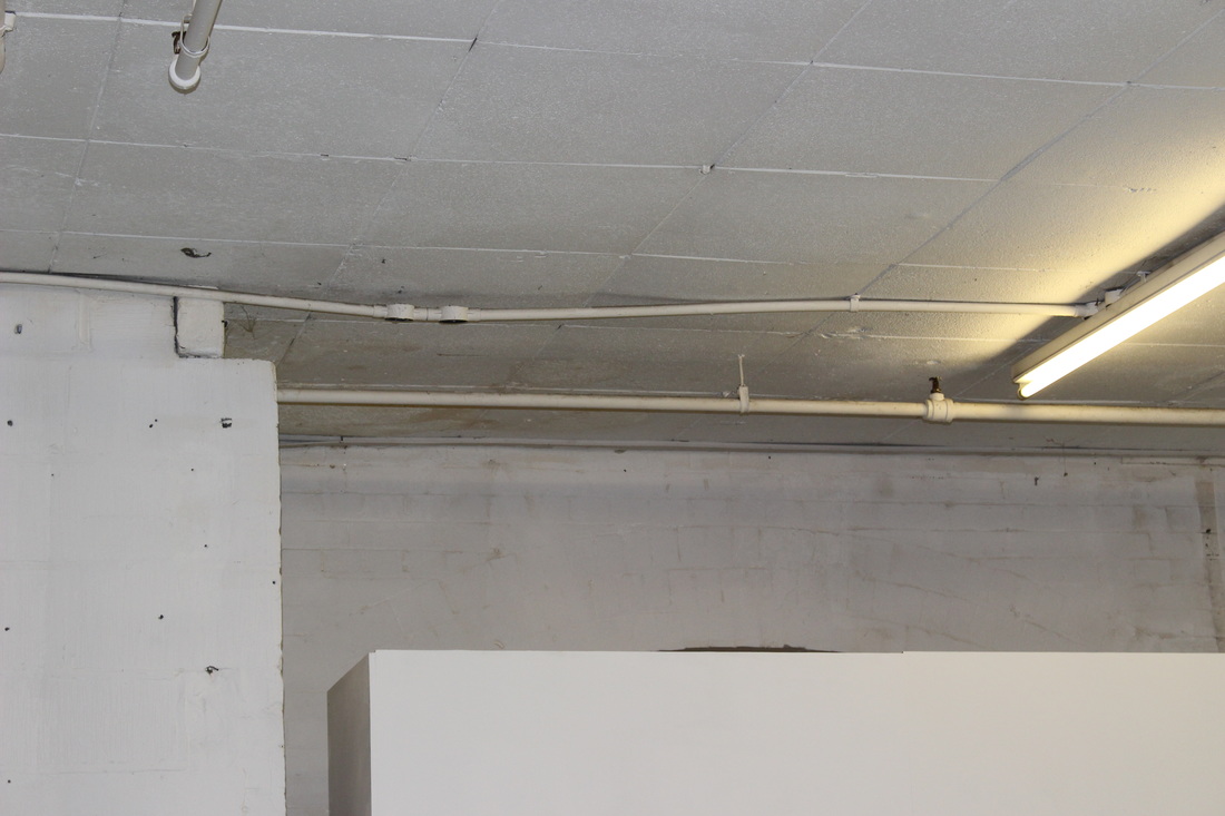
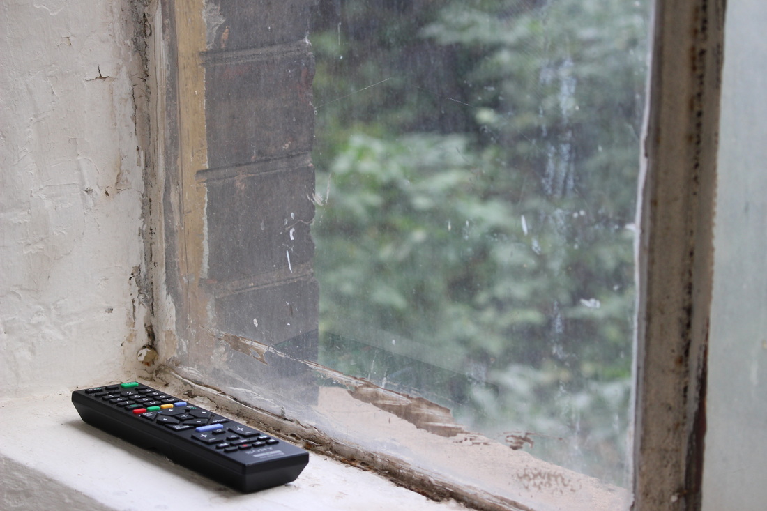
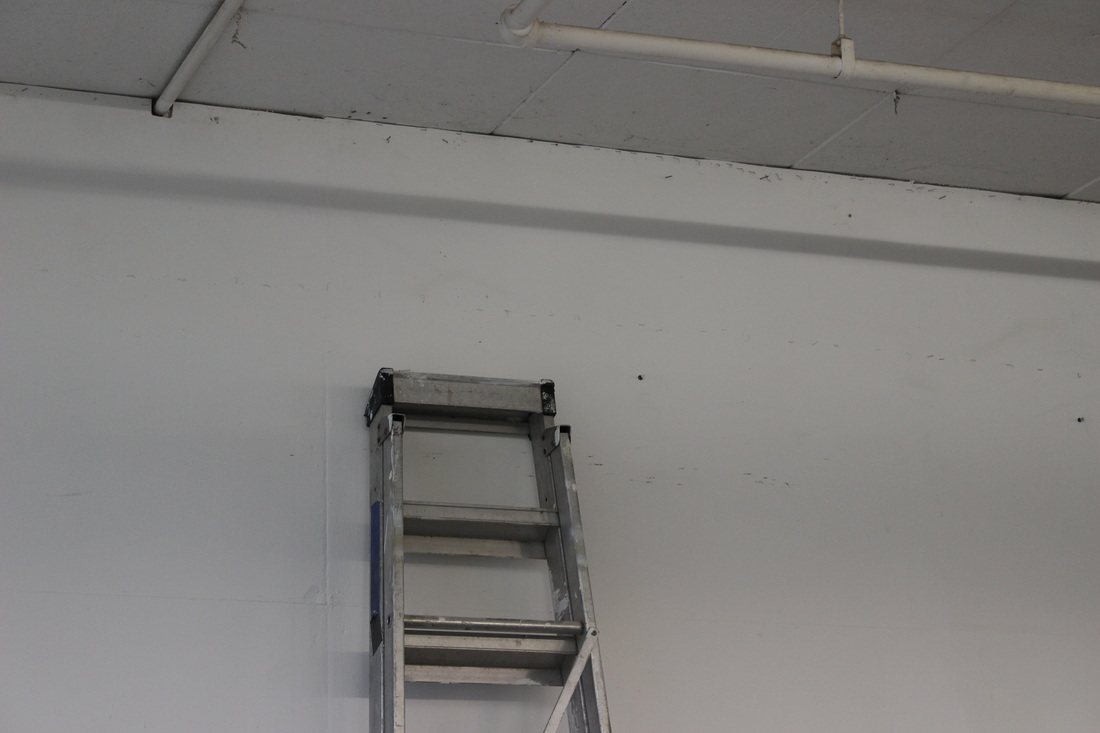
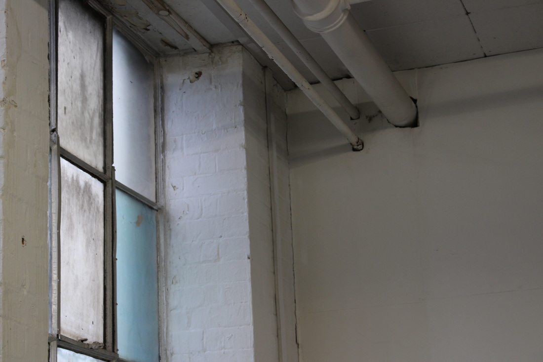
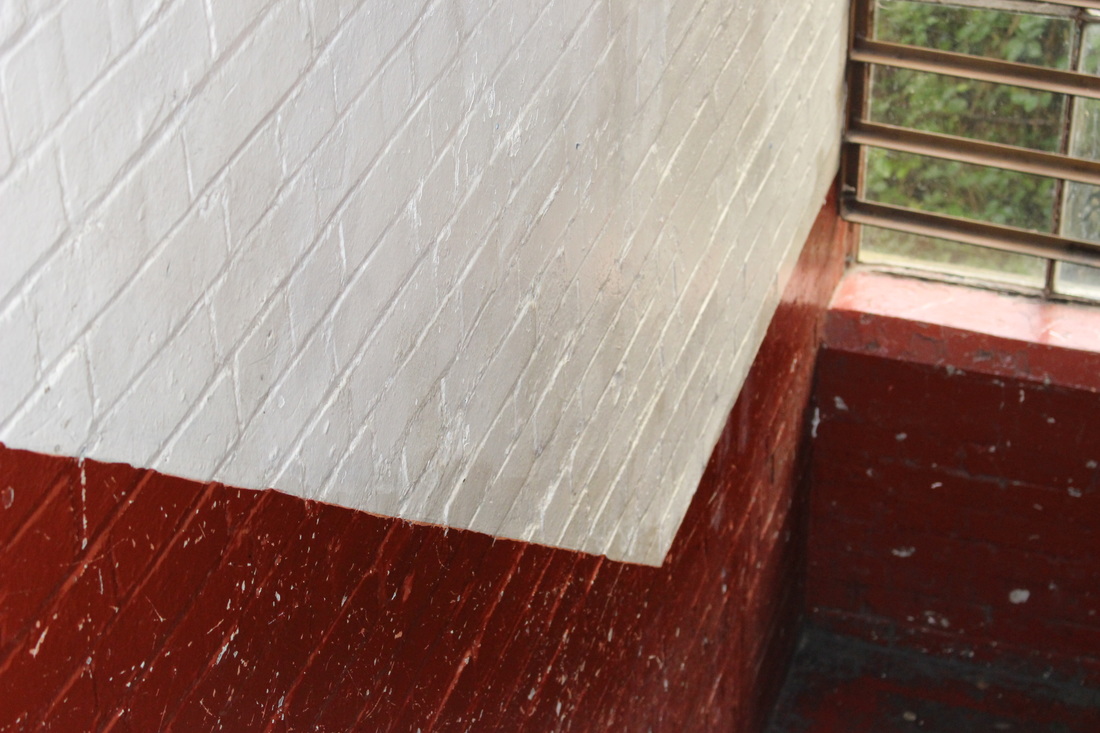
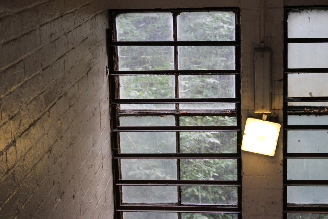
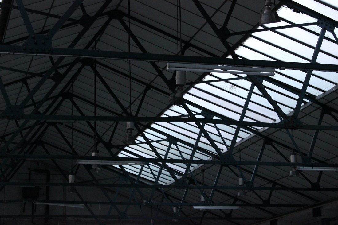
Second Strand - Adam Holtzman
Context - For this strand I will take a minimalist approach and take photos of seemingly empty corners and areas of a room, leaving key details and furniture in the edges and corners of the composition mostly out of view.
Adam Holtzman (American) b. 1975
Currently resides in Providence, RI
Adam Holtzman has dedicated himself to the craft of fine art photography in both his own practice and the promotion of other's work through his former gallery (Alibi Fine Art) and with publications (2054 Press). He is now an exhibiting artist at Alibi Fine Art in Chicago, IL - now under the leadership of Lisa Janes.
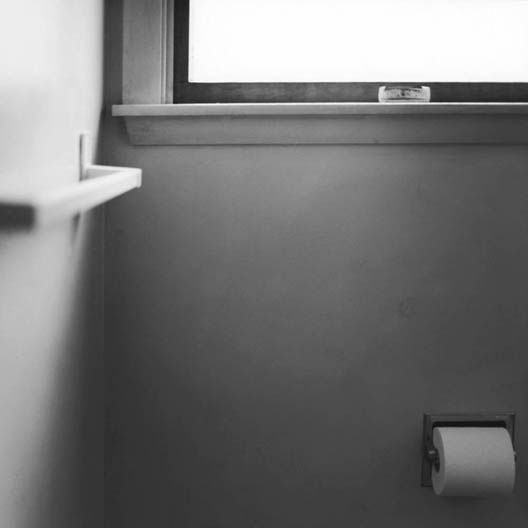
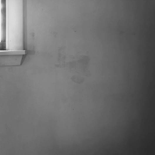
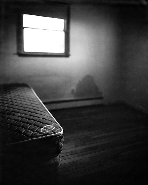
My response
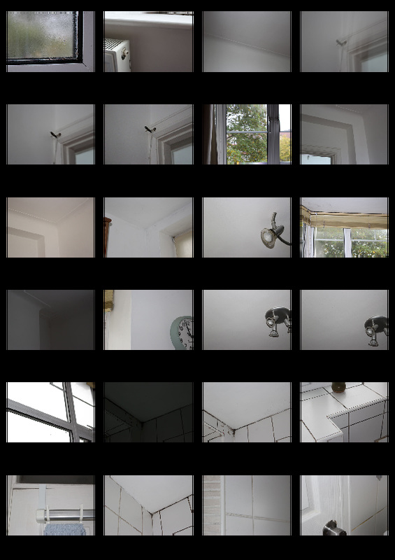
WWW - consistent colour and aesthetic throughout the 24 photos
EBI - next time I could take photos with better lighting conditions, as the photos taken with flash does not look very good and some are too dark.
EBI - next time I could take photos with better lighting conditions, as the photos taken with flash does not look very good and some are too dark.
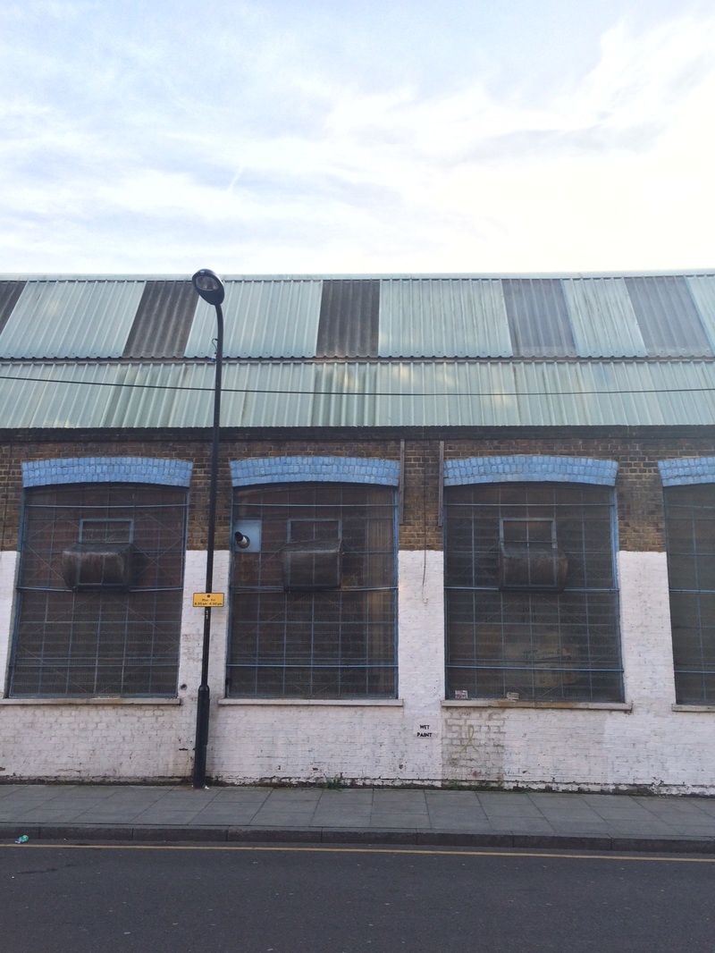
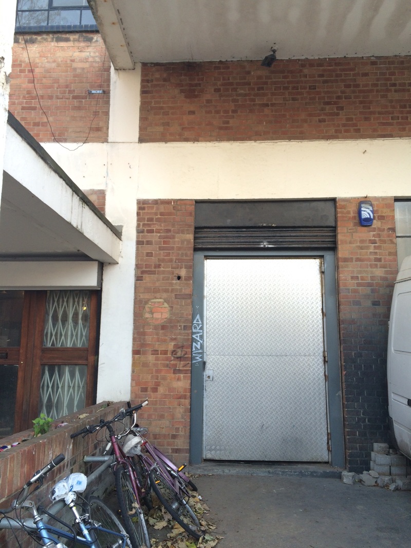
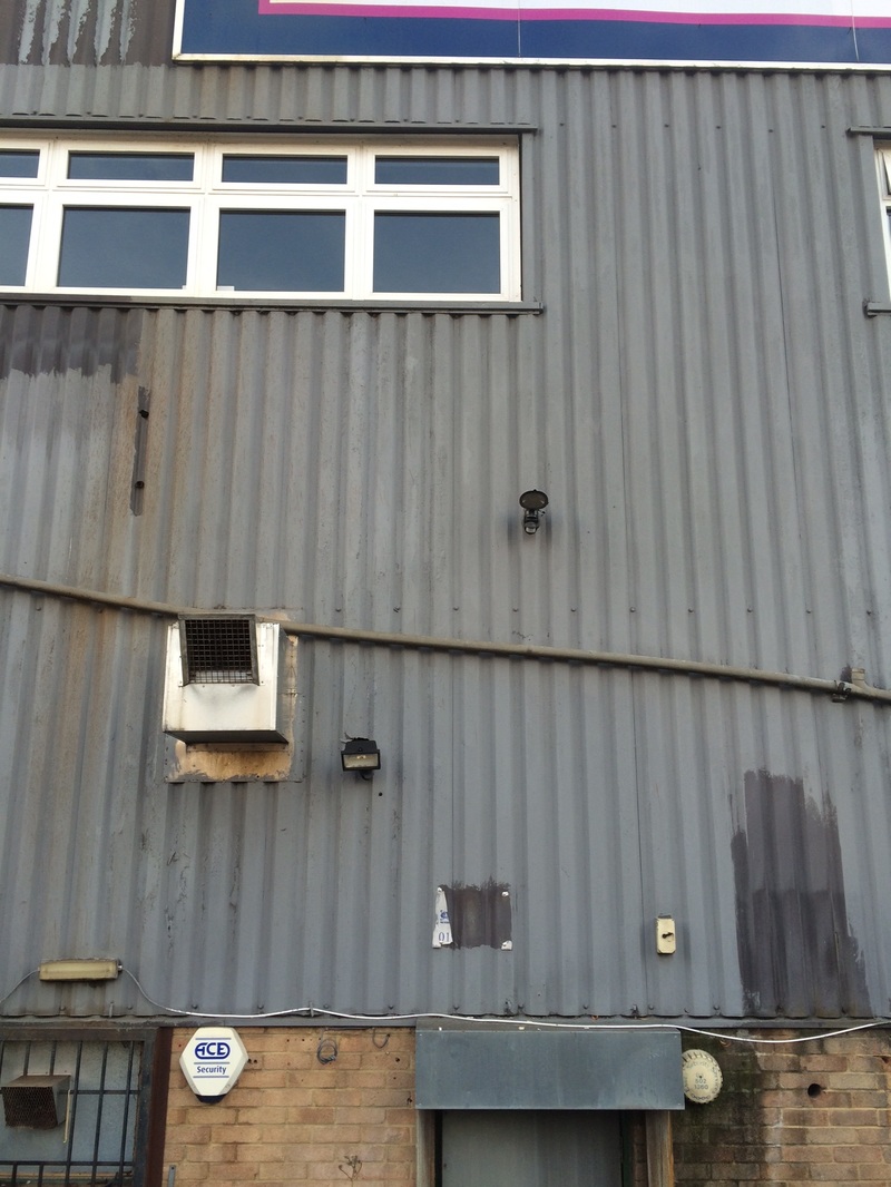
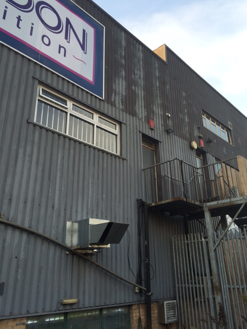
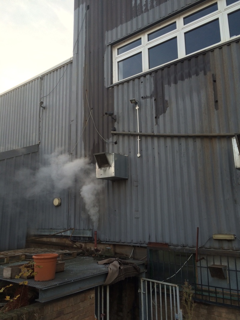
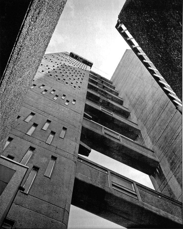
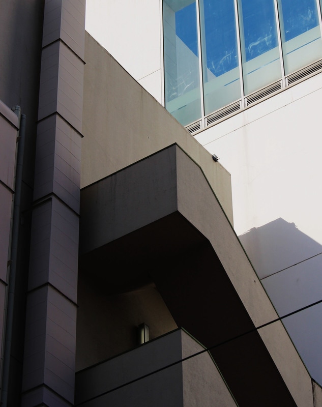
My last strand - Joel Tjintjelaar
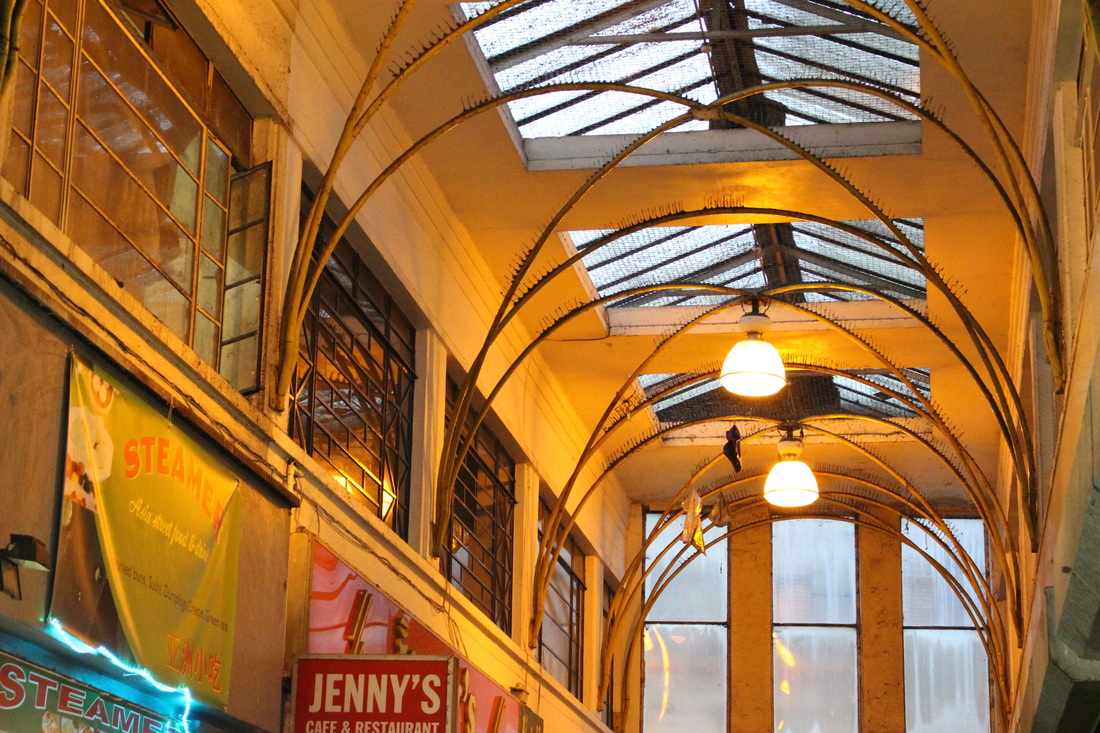
Concept - For this strand I will be taking photos of modern architecture around London. I will be looking at the buildings from a low-angle viewpoint in order to abstract the buildings. I will be paying attention to the horizontal and vertical lines within the composition to draw the viewer's attention to the shape of the building.
Joel Tjintjelaar is an award winning B&W fine-art photographer from the Netherlands. His work has been published on many online websites and in magazines like American Photo, Black + White Photography magazine UK and Dutch magazine Digifotopro to name a few. The artist loves Black and White photography because with the removal of color the essence of objects, situations, scenarios and people can become more visible.
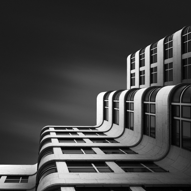
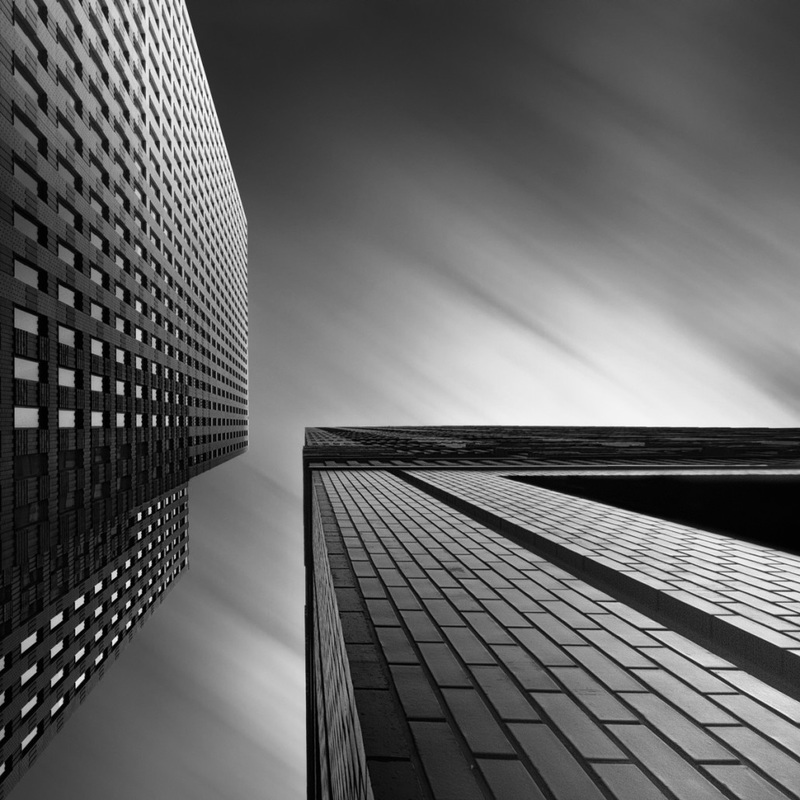
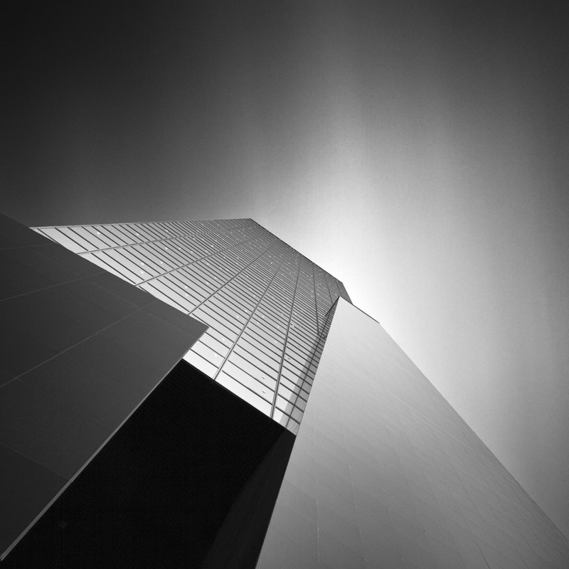
My response
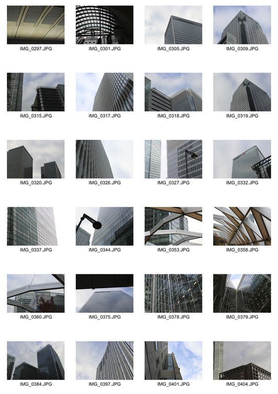
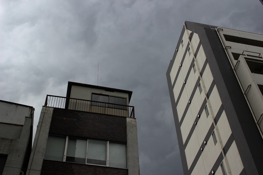
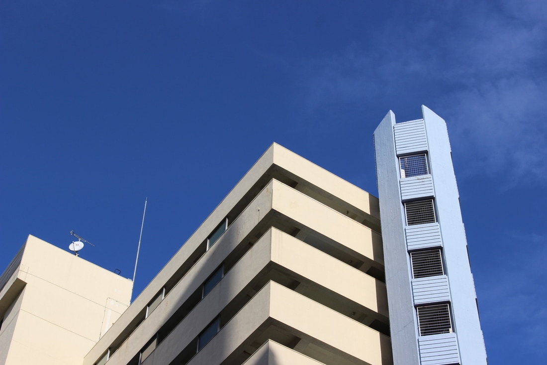
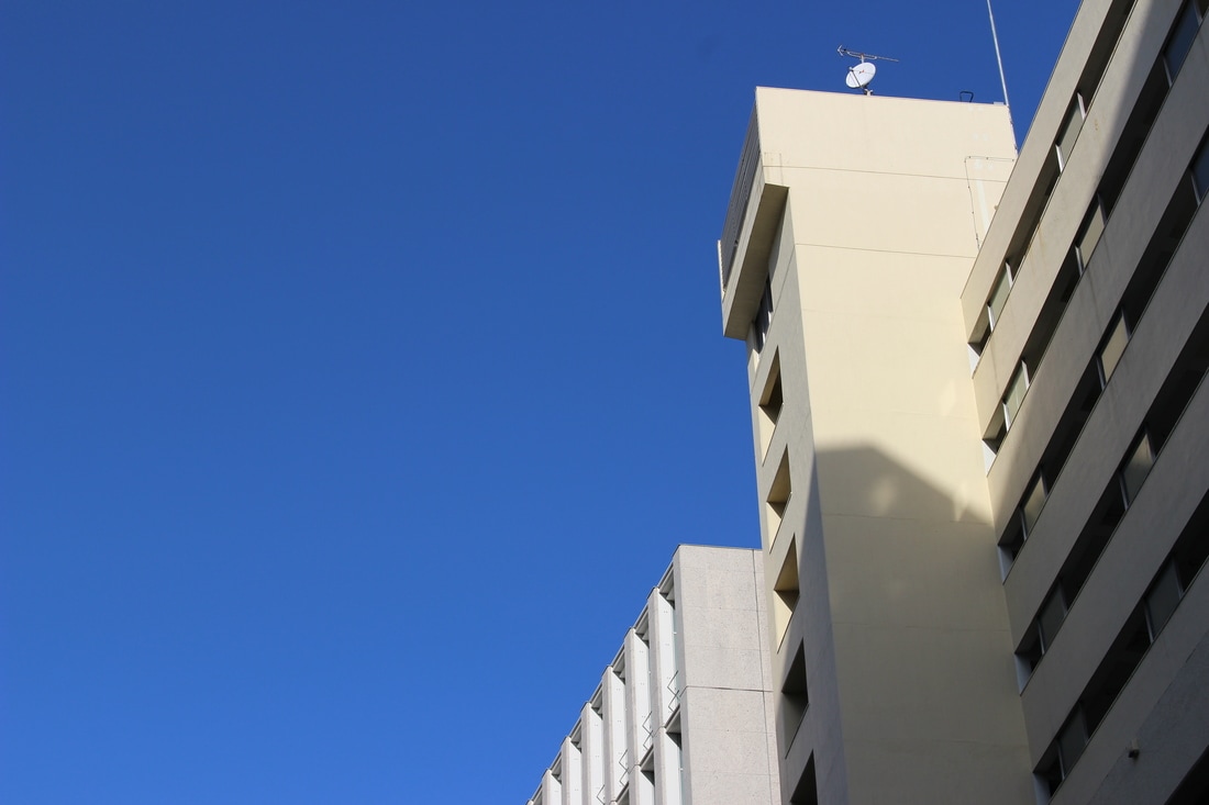
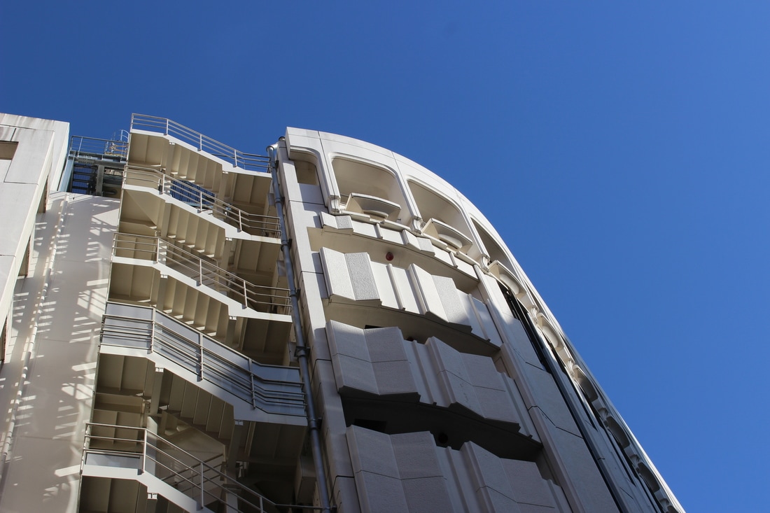
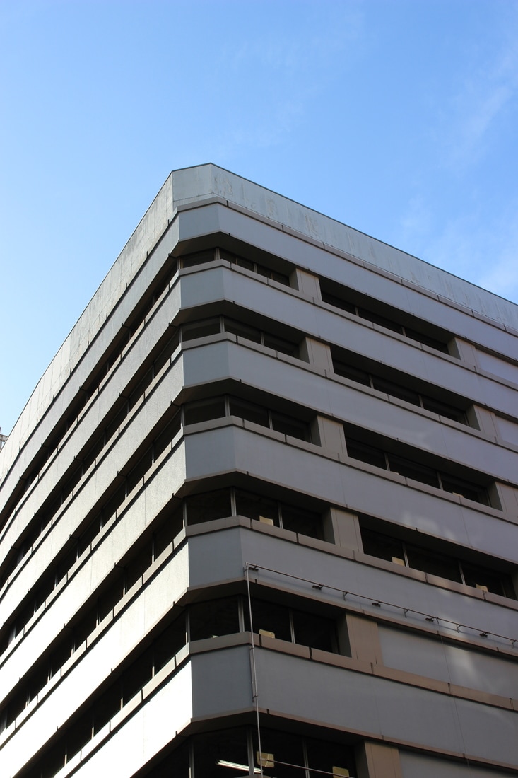
This is the strand I have chosen to develop. For my first development of the strand I decided to visit canary wharf and take photos of the modern architecture from a low position looking up at the building, with only part of the building in view. This causes the buildings to seem very large and imposing to the viewer. I aim to draw attention to the building's sharp edges. Fortunately, the colour of the sky that day also complimented the mostly grey and blue colours of the buildings. The low-key tones and mostly soft light creates a dark and isolated mood. The empty spaces of the sky in the photos also helps to create this tone.
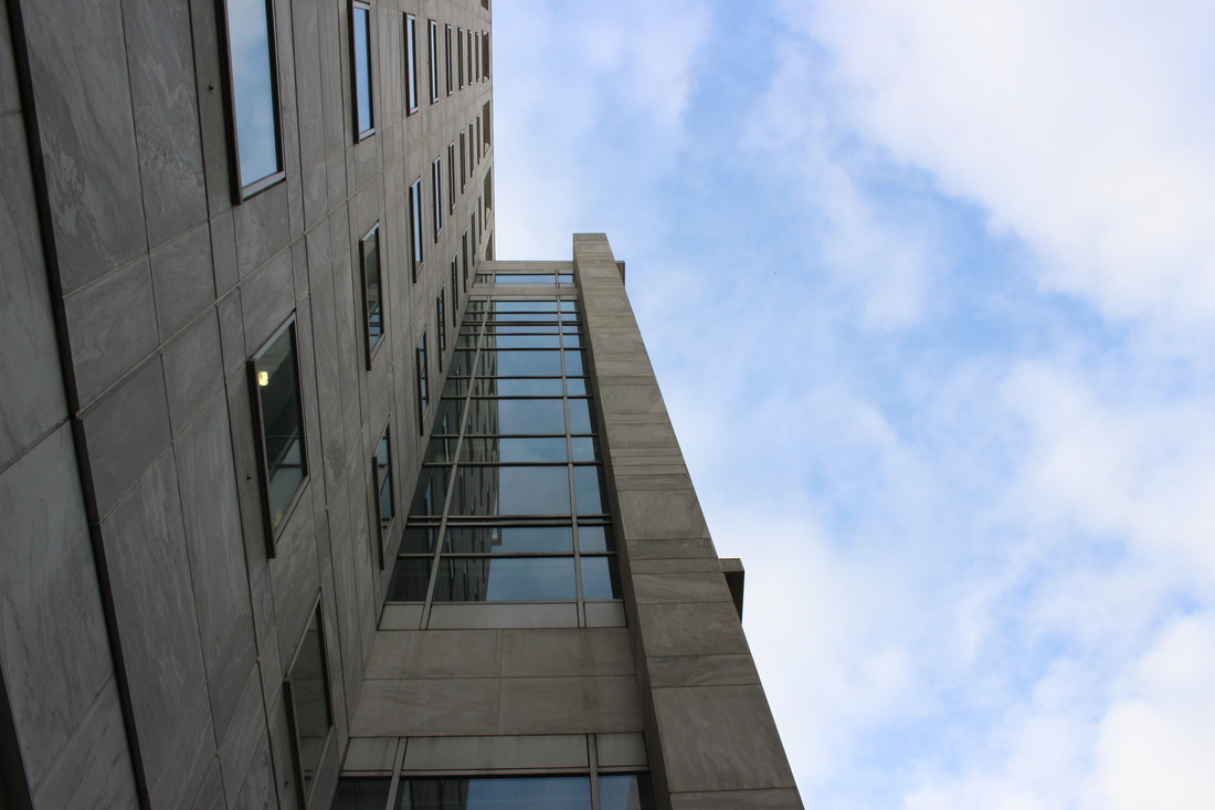
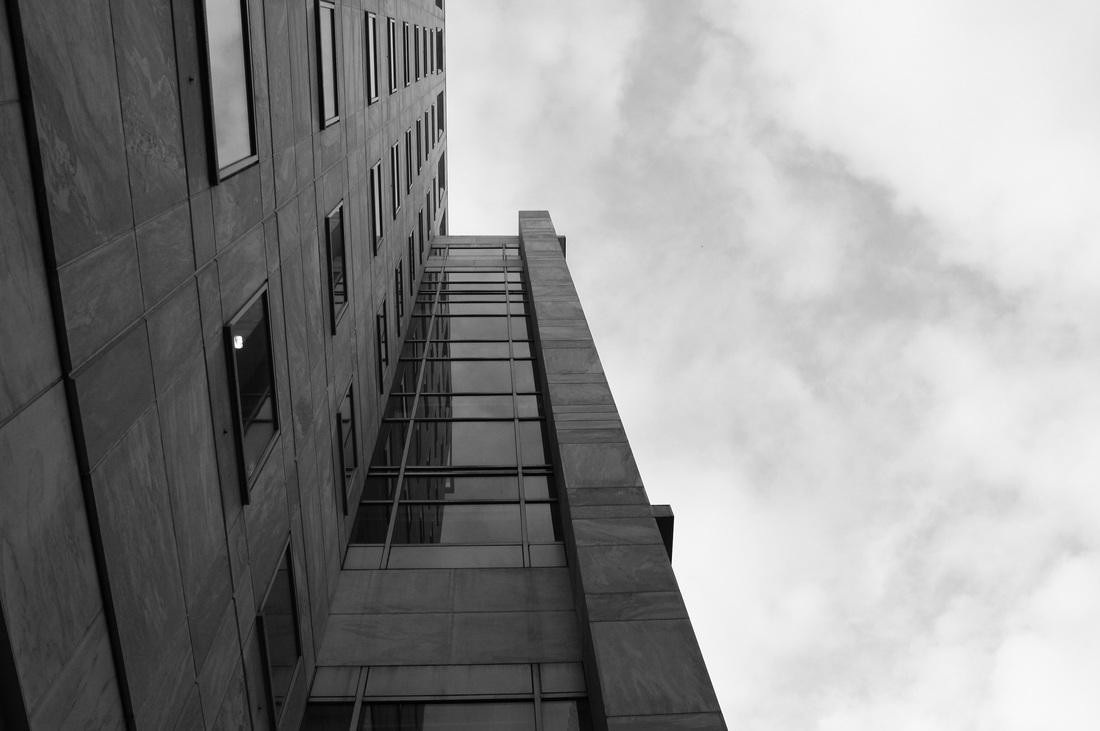
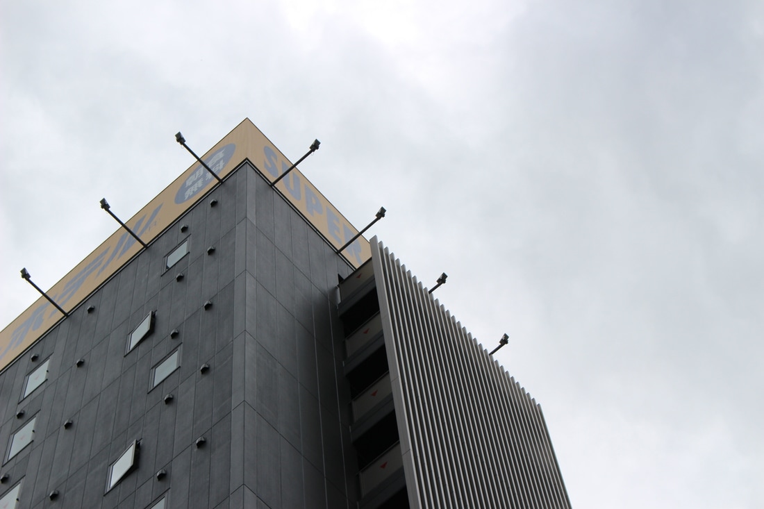
I chose my favourite photo out of all the ones I took and decided to make it black and white. This is so that it looks more similar to Tjintjelaar's work. It also replicates his work the most out of all the photos I have taken, as it was taken very close to the base of the building.
WWW - I am very satisfied with all the photos I have taken for all the photos in this development.
EBI - I could have taken more photos from the base of strutures
WWW - I am very satisfied with all the photos I have taken for all the photos in this development.
EBI - I could have taken more photos from the base of strutures
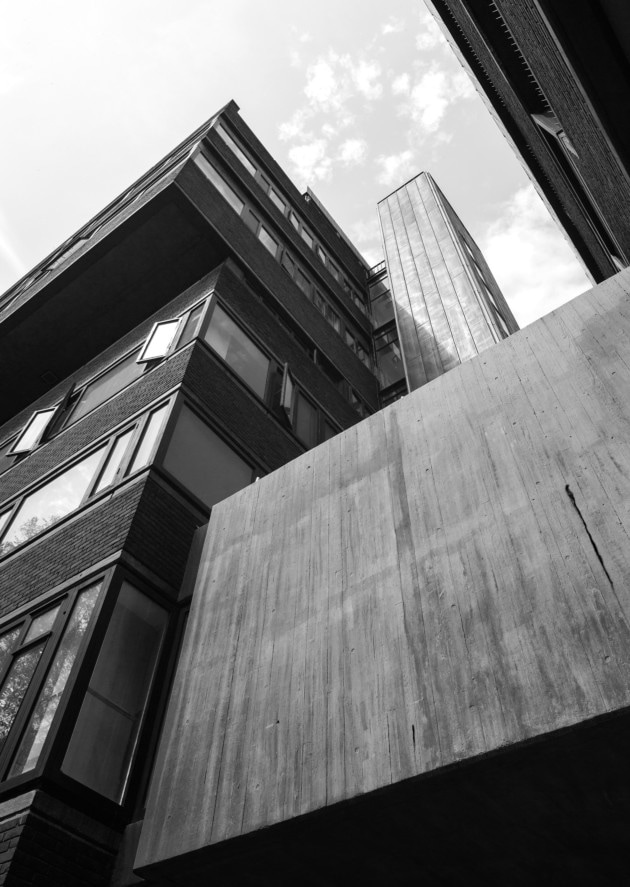
My first development
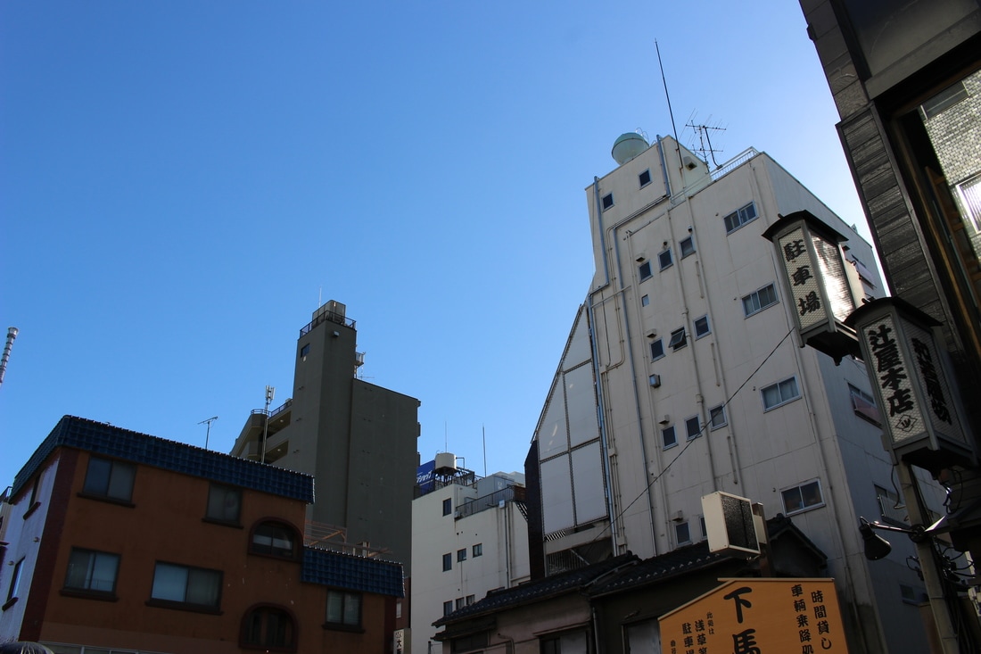
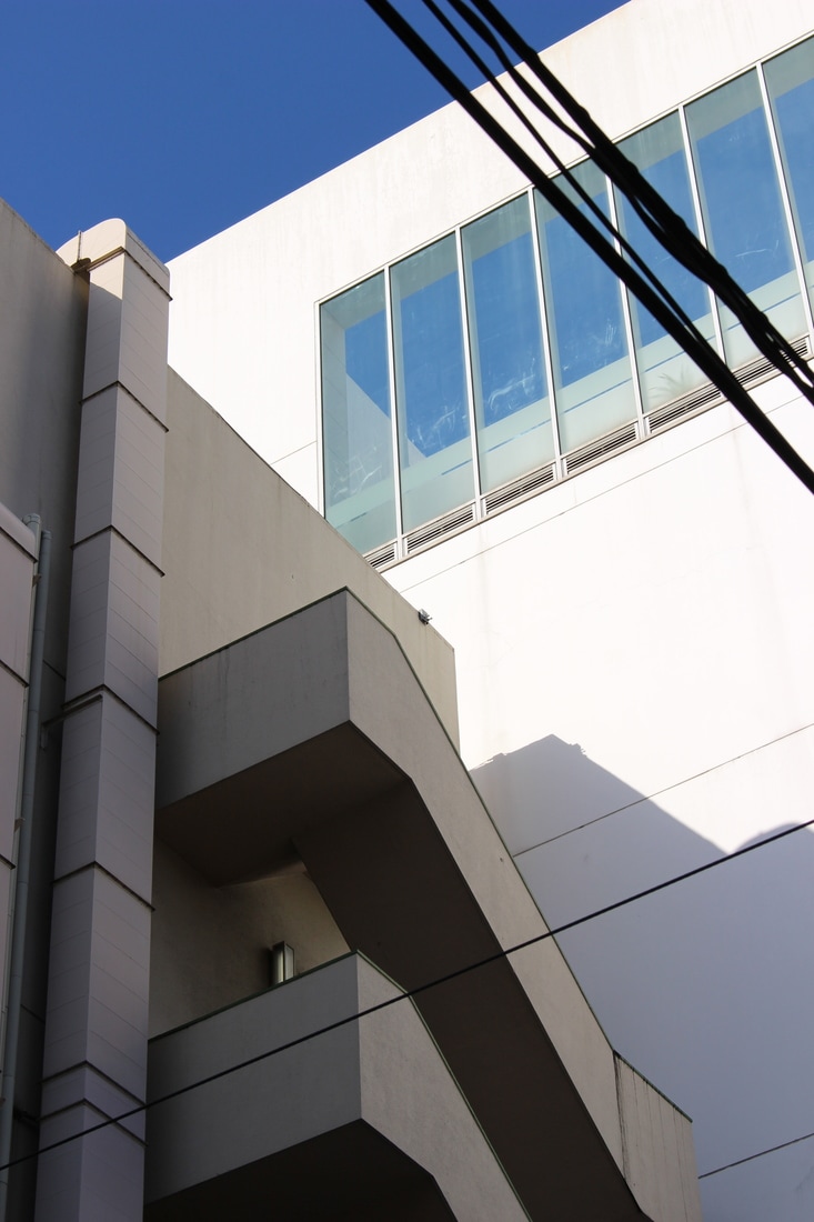
to expand on this strand I decided to take photos at the Brunswick Centre in Camden. It is well known for its brutalist structures. I decided to take many of the photos at a low angle, looking up. I decided not to make any of the photos black and white as I liked the colour of the sky and how it contrasted the light beige colours of the structures. This time the sky sharply juxtaposes the colour of the buildings as I tried to create a brighter and more cheerful mood. I also tried to make the buildings seem more grand and formidable by positioning myself so that the light came from the back of the buildings, creating a higher contrast tone. Unfortunately, these photos does not have a full range of tones, so for my next development I will try to shoot from a different perspective and increase the tones in my photos. I will also try to frame the photos differently next time to create more balanced images.
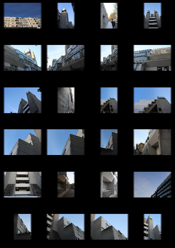
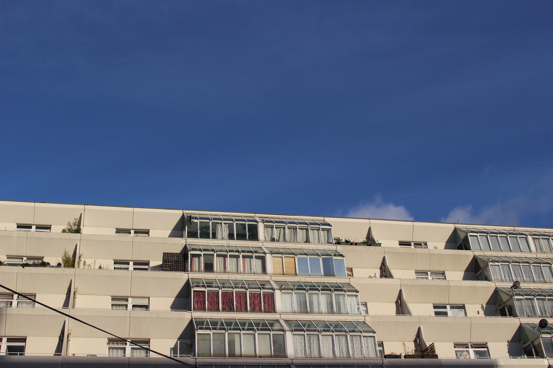
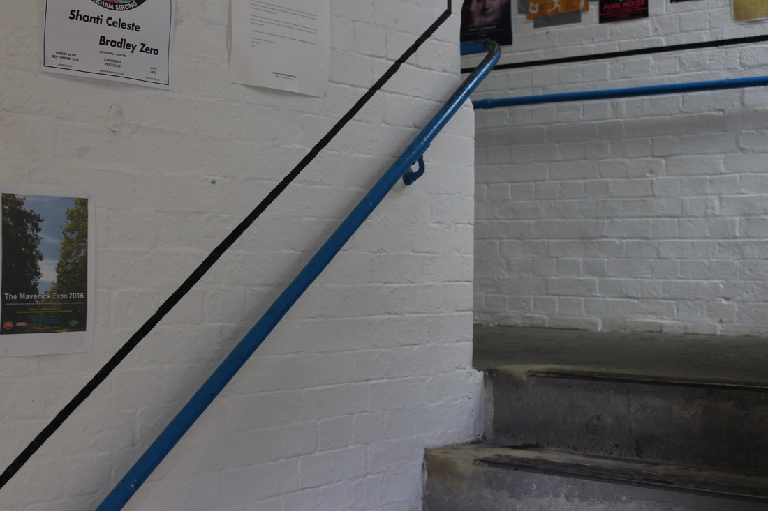
The above photo is one of my favourites on this strand as I love the sharp contrast of the plain beige colours of the concrete and the bright colour of the sky above. The curtains by the window also adds variety to the composition. The symmetry of the structure also draws attention to the horizontal and vertical lines of the structure. This is also one of the best-lighted photos I've taken so far.
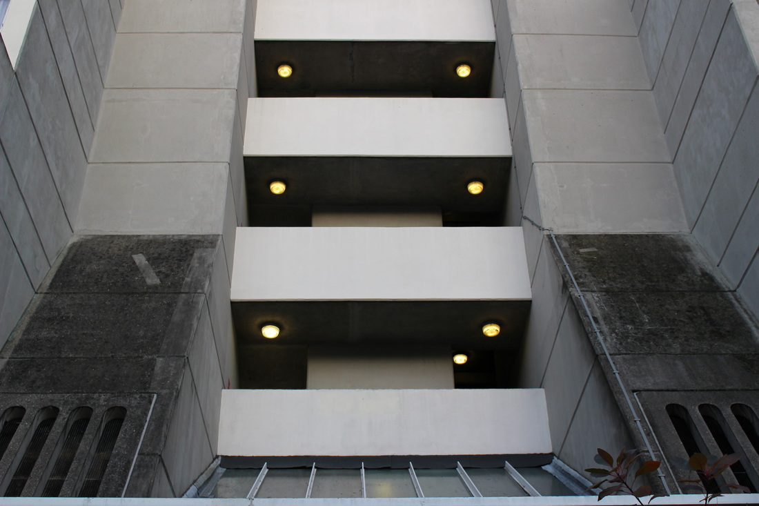
I love this photo as this section of the building is almost perfectly symmetrical, except for the extra light on the bottom level of the stairs. This level of straight lines and symmetrical designs of the buildings is what I try to capture in all my photos for this strand.
WWW - the colour of the scheme matched the colour of the building very well.
EBI - there were more symmetrical photos.
WWW - the colour of the scheme matched the colour of the building very well.
EBI - there were more symmetrical photos.
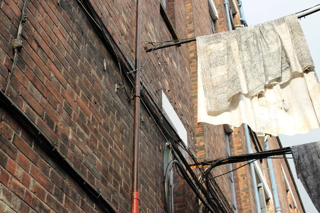
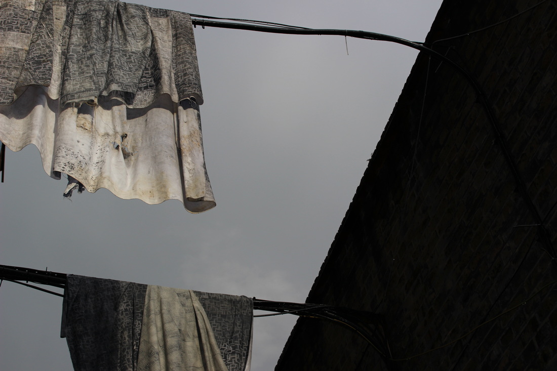
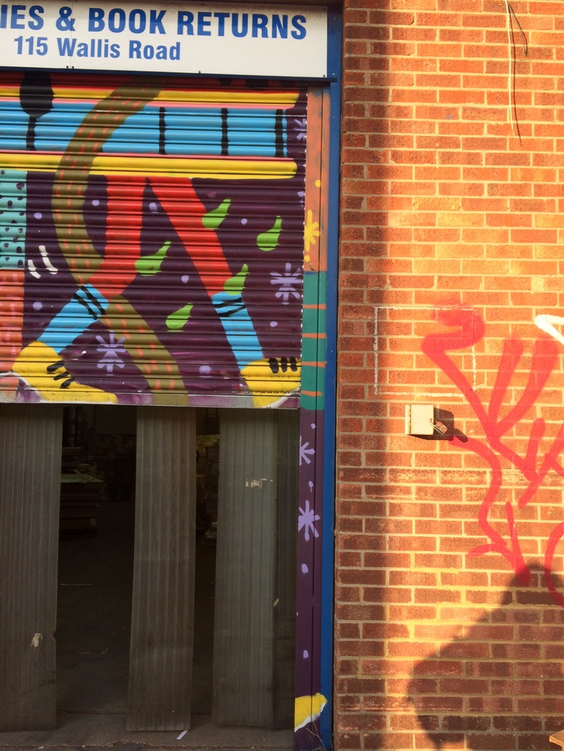
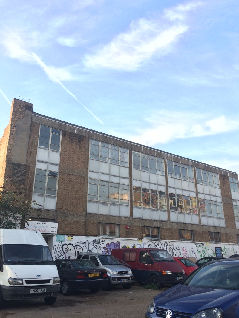
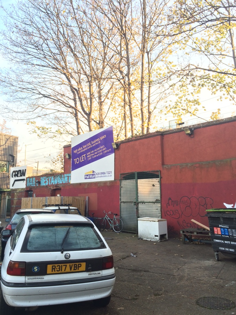
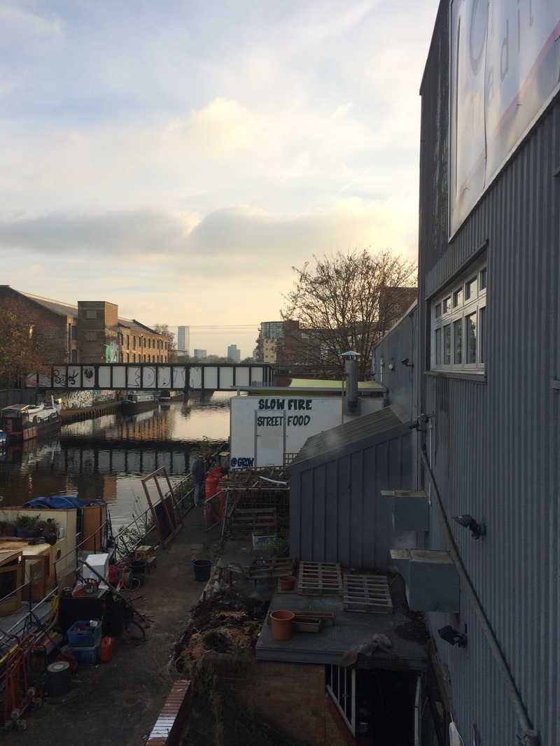
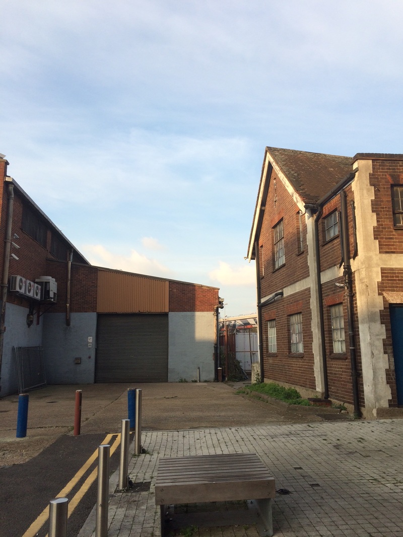
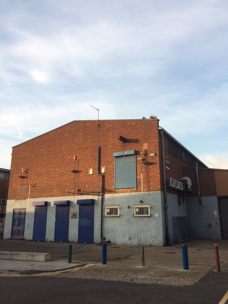
Third development - Fish Island/Hackney Wick
For this development I tried to recreate the symmetrical architectural shots, seen in some of the shots from the last development, but this time from ground level instead of from a low angle in the style of Lewis Baltz. I visited fish island in Hackney Wick. Unfortunately I did not have my camera this time so I took the photos with my iPhone 5s. I aimed to capture colour and industrial nature of the buildings and the areas surrounding it. A part of my development is to make my photos different from the black and white nature of the original Lewis Baltz photos I was inspired by, by allowing colour in the shot and more depth in the composition.
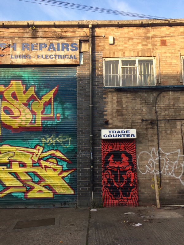
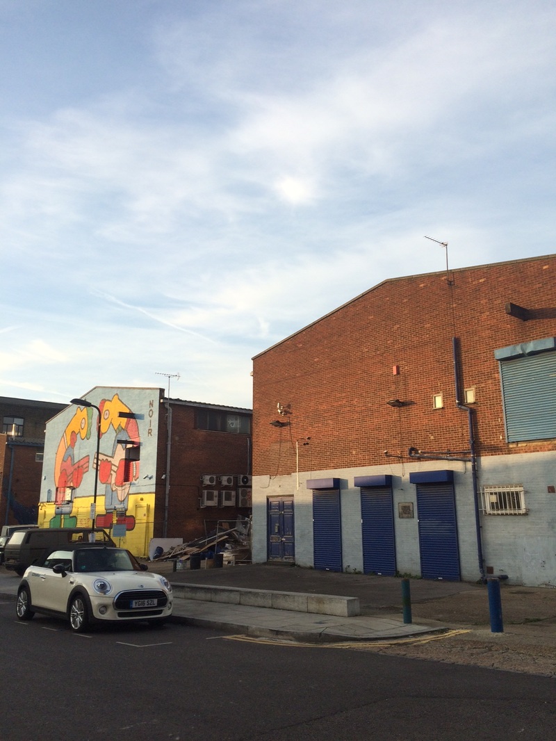
This is one of my favourite photos from the ones I took in Hackney Wick because of its bright colours. I straightened the horizontal axis of the photo and sharped the photo (amount 80%, radius 1.2, threshold 0.). I adjusted the saturation slider to +20 to make the photo stand out more and make the colours even more eye catching. I love how the natural sunlight on the top of the building compliments the bright artificial graffiti on the walls and contrasts the dull and dark brick structure.
For this photo I turned down the brightness to -39 as the sky in the background was too light, and turned up the contrast to 25. I also sharpened the photo. This gave the photo an overall grainy and rugged feel, bringing out the industrial nature of the setting of the photo.
I took this photo on a balcony overlooking a walkway by the canal in Hackney Wick. This photo is different from the previous two as it has more depth in its composition and it's more crowded. Like before I sharped the image on photoshop and turned up the contrast. This time I turned down the brightness as the sky in the background was too bright. Lastly, I put on a black and white filter, inspired by Lewish Baltz's work.
WWW - There were a large variety of colours and different types of buildings in the photos
EBI - I could have replicated Lewis Baltz's style better as many of the photos are not very similar to his style. I also should have used a camera instead of an iPhone to take the photos, but I did not have it at the time.
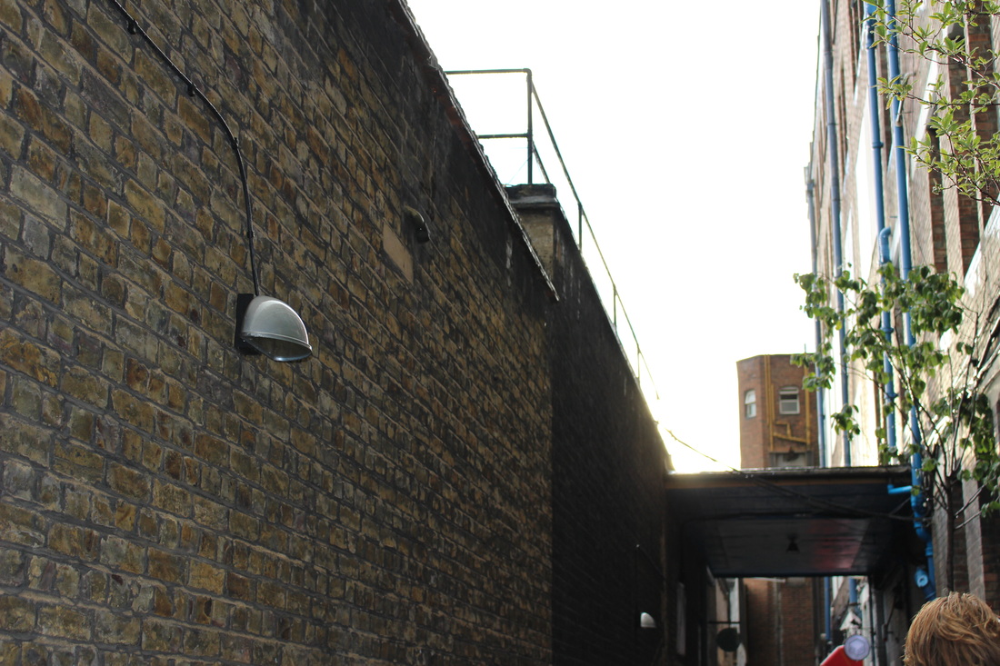
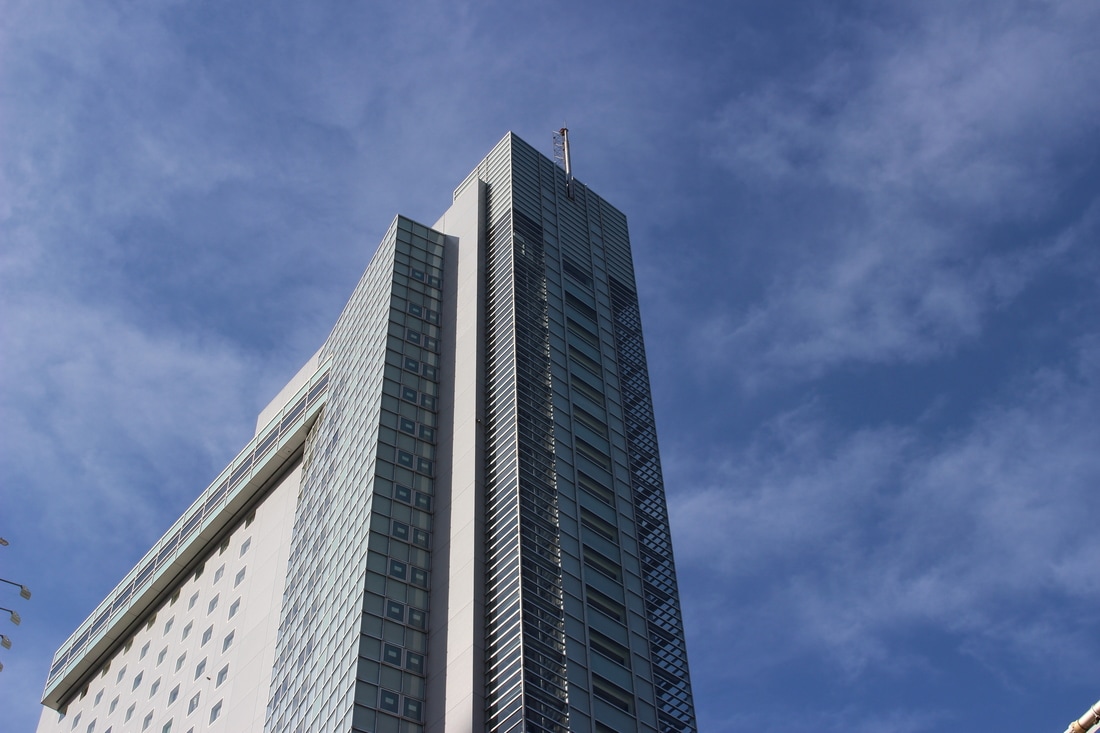
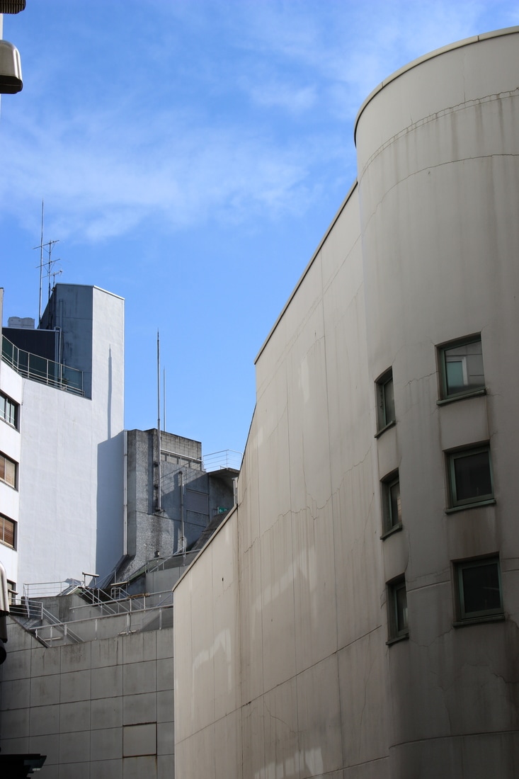
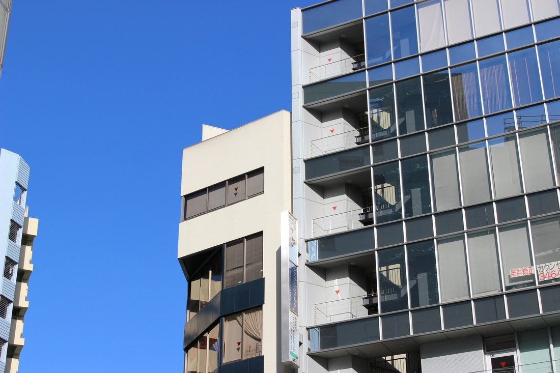
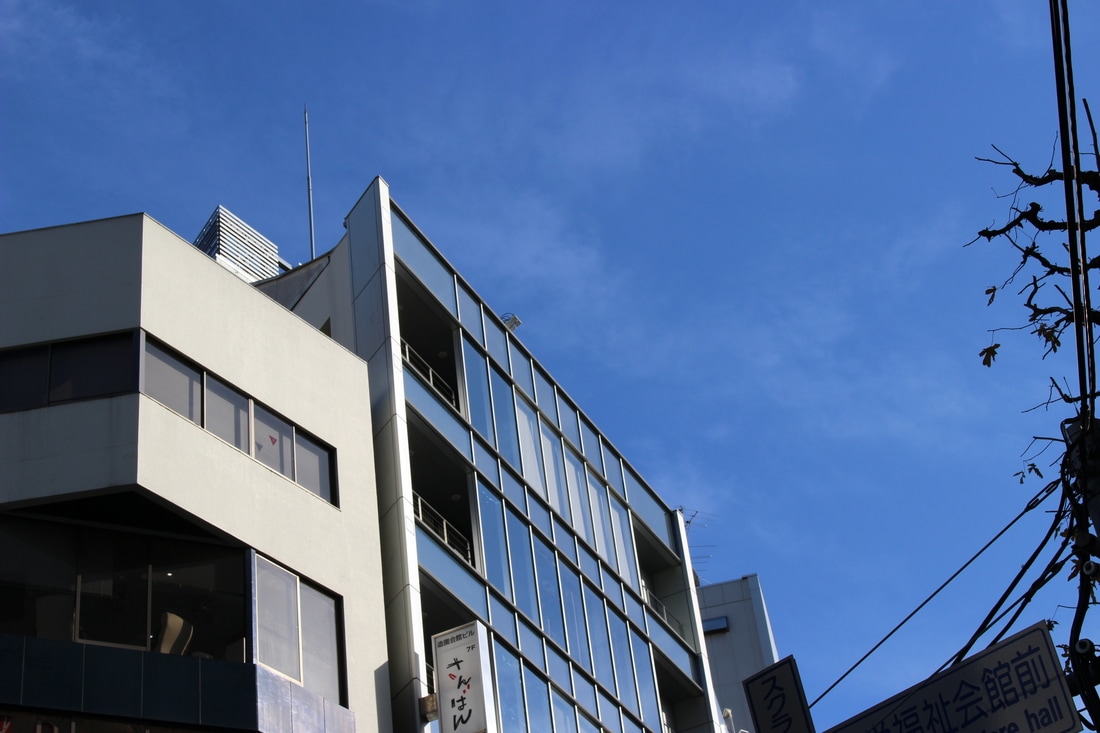
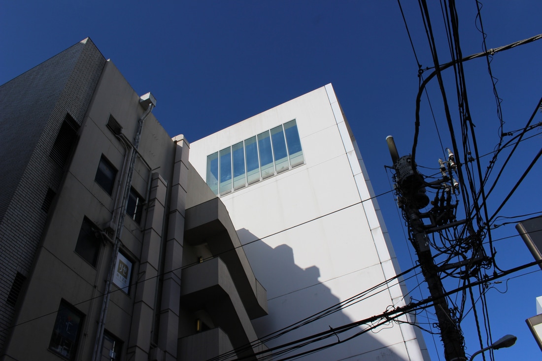
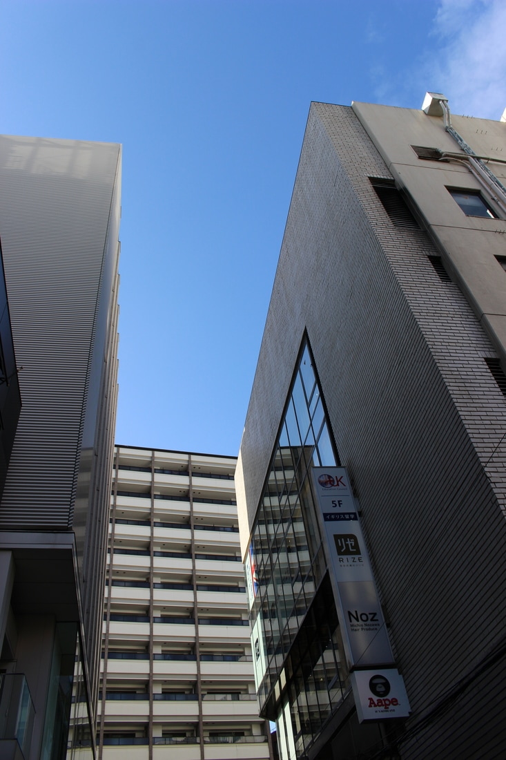
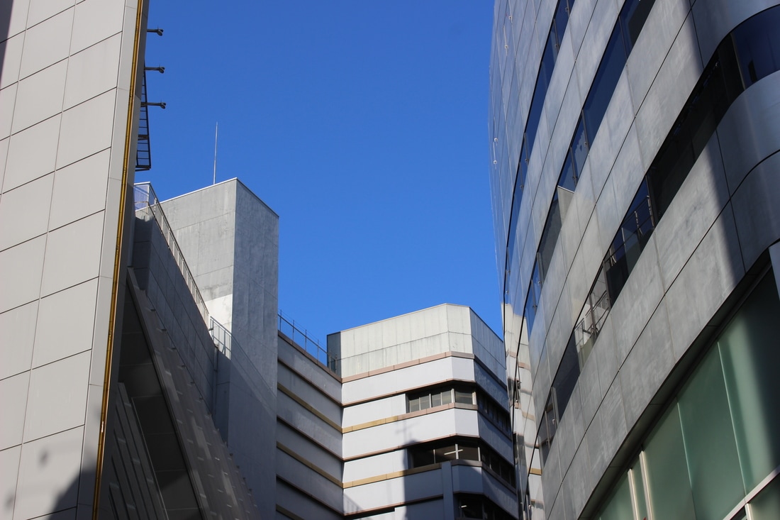
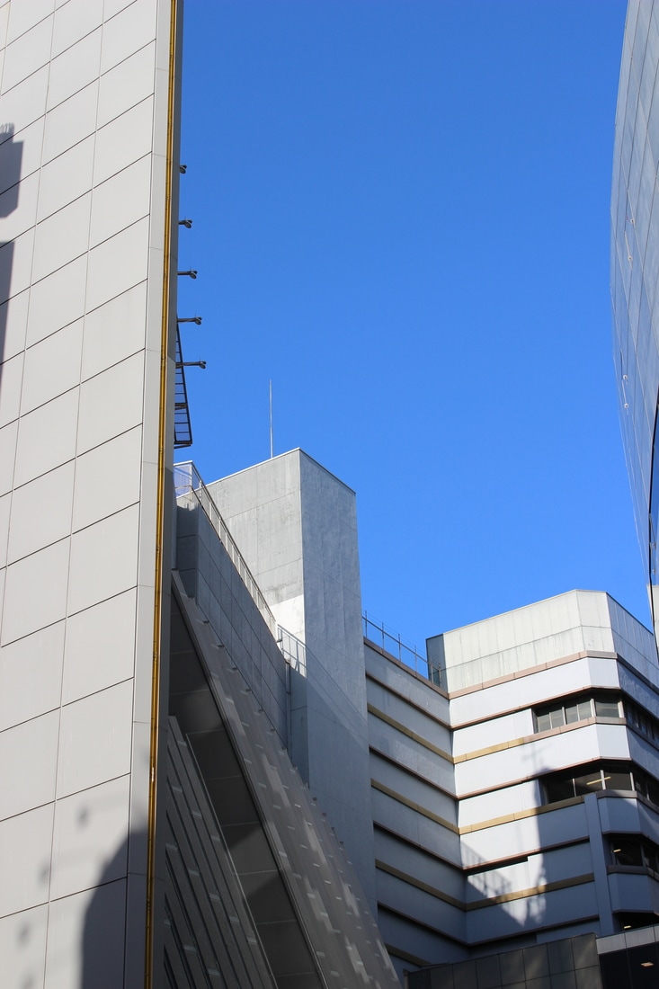
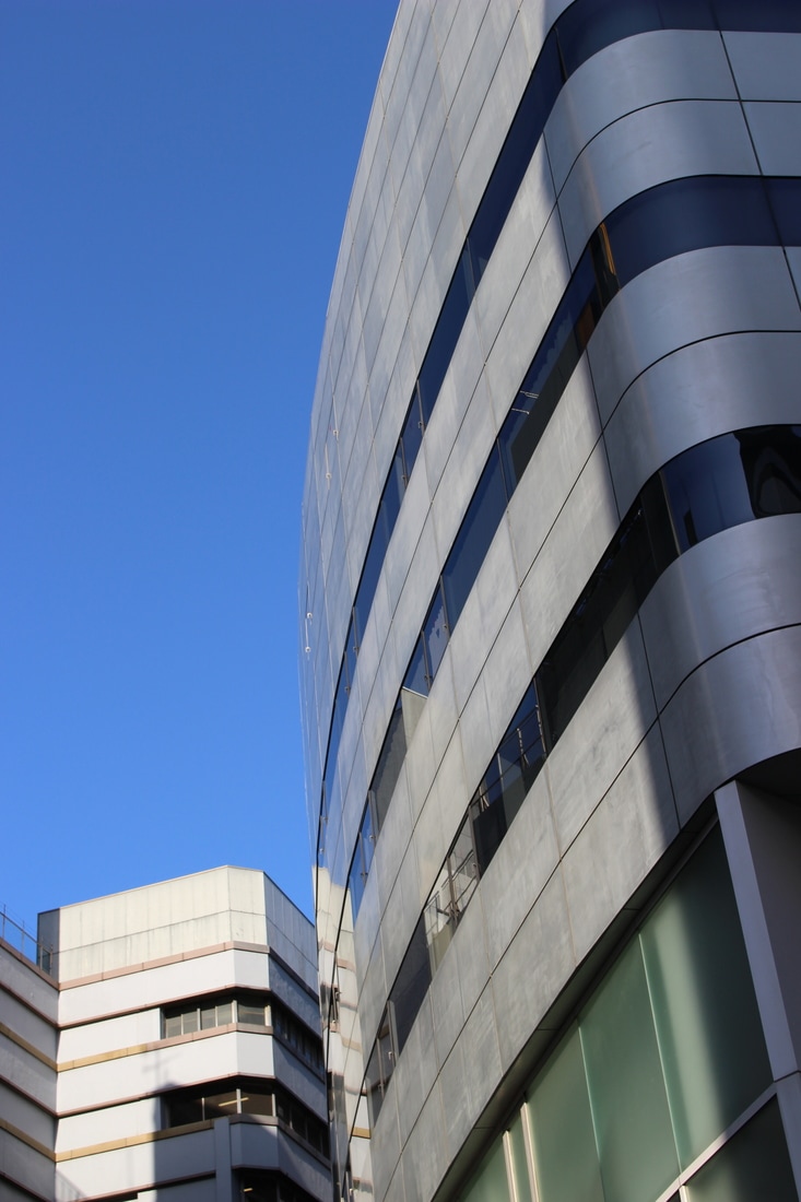
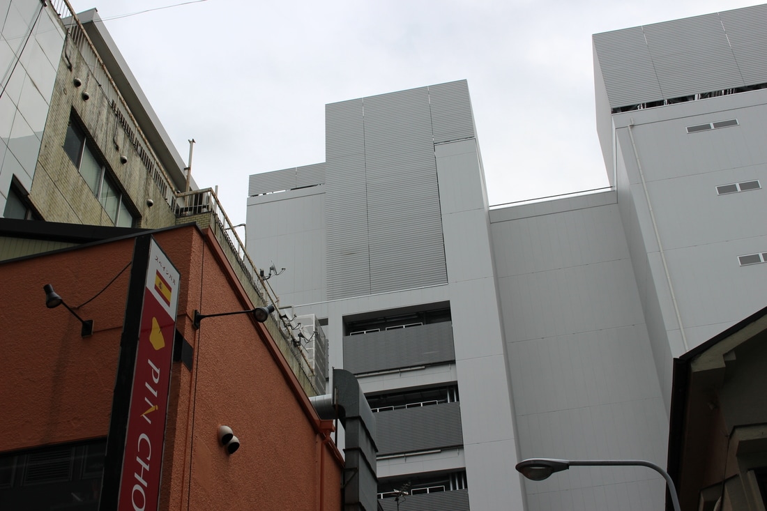
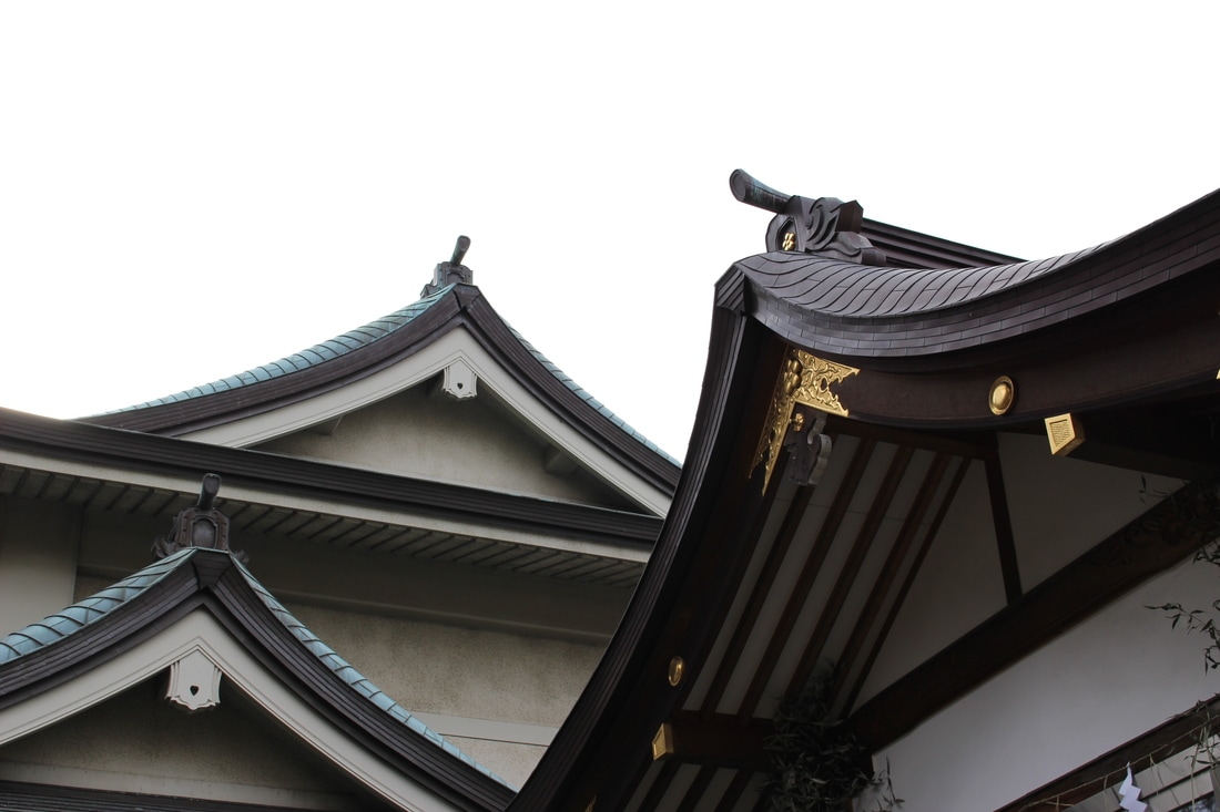
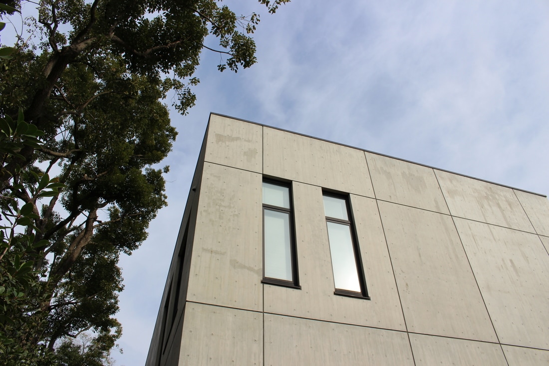
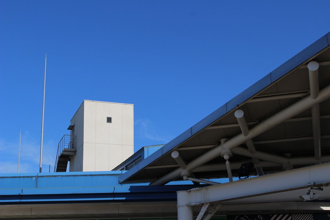
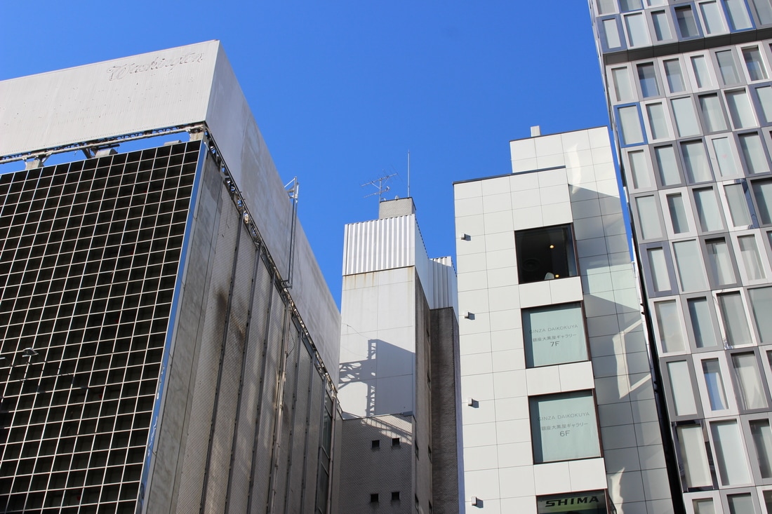
Fourth development - Simon Phipps
For this piece I decided to explore the style of Simon Phipps. This is similar to the first development in terms of camera angle, but different in term of its compact composition. This is what I tried to replicate in my photos, taken in Tokyo.
I chose mainly straight and plain coloured buildings to replicate the brutalist structures of the buildings in Simon Phipps' work. Not only did I try to capture the buildings from a low angle I also tried to layer the structures and placing them in front of other structures in my composition, especially evident in top-right photo and bottom-left photo of temple roof tops.
I chose mainly straight and plain coloured buildings to replicate the brutalist structures of the buildings in Simon Phipps' work. Not only did I try to capture the buildings from a low angle I also tried to layer the structures and placing them in front of other structures in my composition, especially evident in top-right photo and bottom-left photo of temple roof tops.

|
WWW: I chose this as one of my final pieces because the composition of the structures in this photo is similar to a piece of Phipps' work that I like. There are three different types of buildings in both images. In my

|
Photobox exam piece
For my mock exam piece I decided to make a photo book as it would be the best way to present my mainly unedited photos. I thought the square format of the photobook would compliment the largely modern and straight-edged buildings in my photos very well. The photo locations are all based in London and Tokyo.
I reduced the image size for all the photos imported onto the computer from my SD card so they could be put on the photobook. I then selected the templates for each page and chose to allocate the photos on each page in relation with the overall theme and locations. For example the theme for the first two pages are brutalist structures in London and the next couple pages are only photos taken in Canary Wharf.
I reduced the image size for all the photos imported onto the computer from my SD card so they could be put on the photobook. I then selected the templates for each page and chose to allocate the photos on each page in relation with the overall theme and locations. For example the theme for the first two pages are brutalist structures in London and the next couple pages are only photos taken in Canary Wharf.
Final Images
Image 1
|
Firstly, I chose to apply curve to brighten and turn up the saturation of the image.
Then, I put a black and white filter over the image Lastly, I cropped out most of the image to make the photo abstract. Final image. |
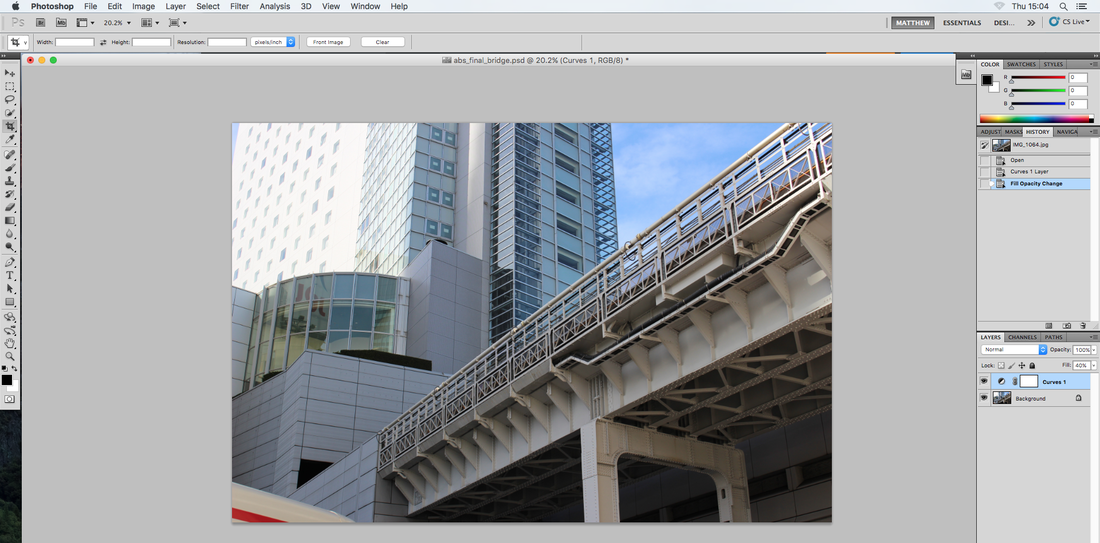
Final Image 2

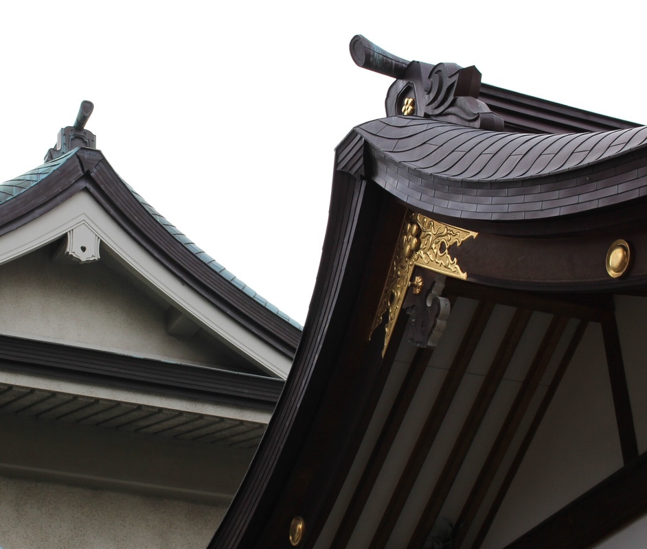
|
|
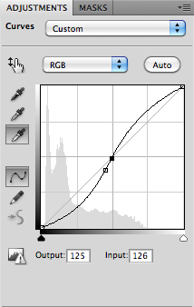
I changed the white point of the image and the curve to output 125 and input 126. (S curve)
I then cropped the image into the square image on the left. |
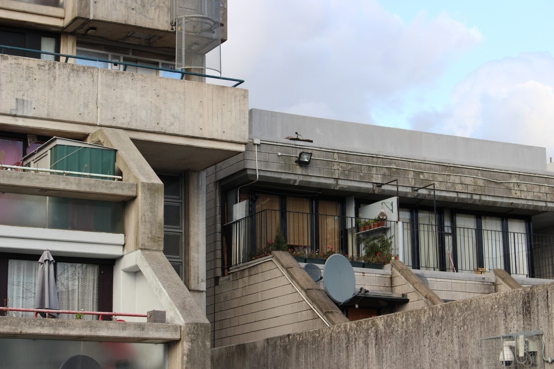
Final Image 3
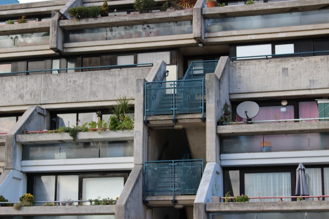
|
This is the original image
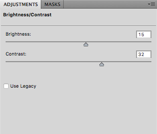
I turned the brightness up in the brightness/contrast section in the adjustments palace and manually turned the brightness up to 15 and contrast to 32. Then I went on the filter section and selected sharpen, then unsharp mask. In the settings I selected amount 80%, Radius 1.2 and kept the Threshold at 0. Lastly, I cropped the photo to make it more abstract. |
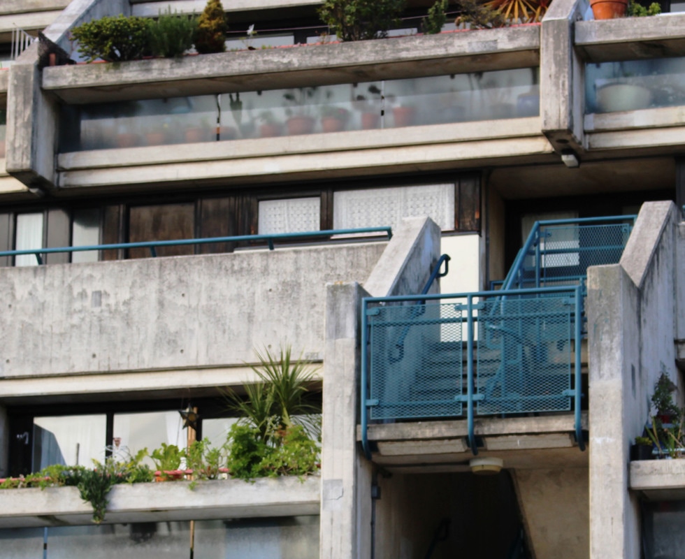
Final Image 4
|
This is the original image
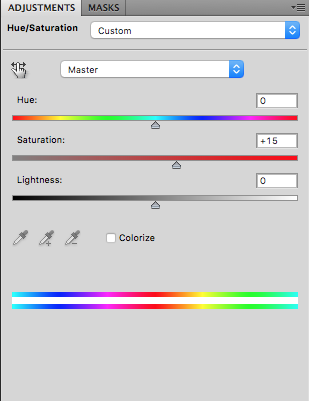
I turned the contrasts all the way up to 63 to sharpen the image I then increased the saturation to +15 to brighten the image. Lastly, I cropped the image to make it more abstract. |
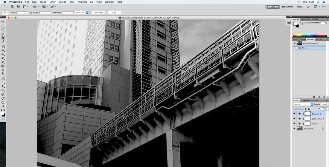
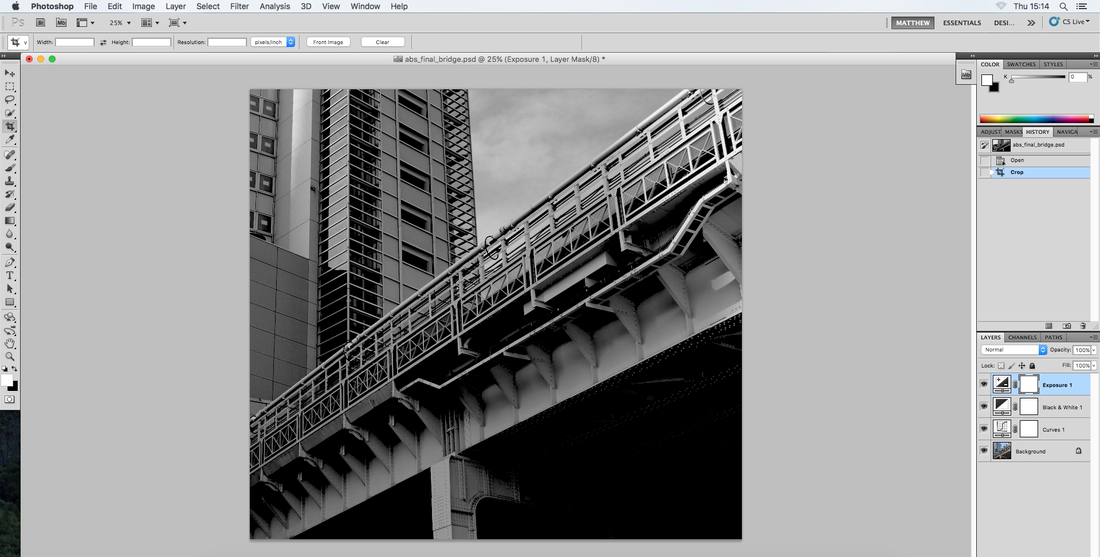
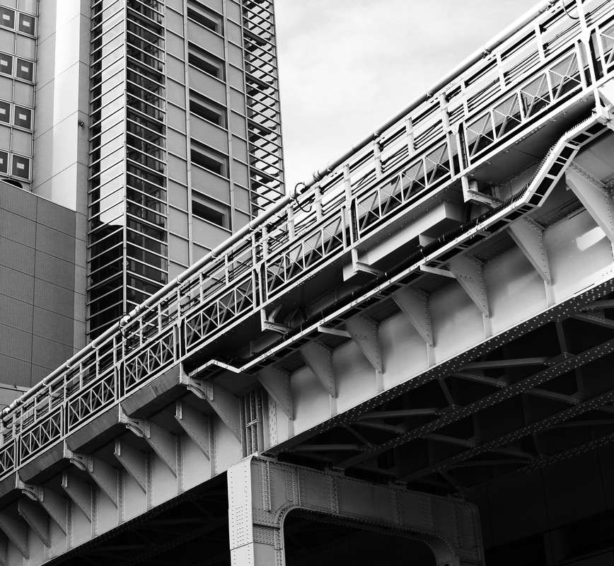
Final Image 5

|
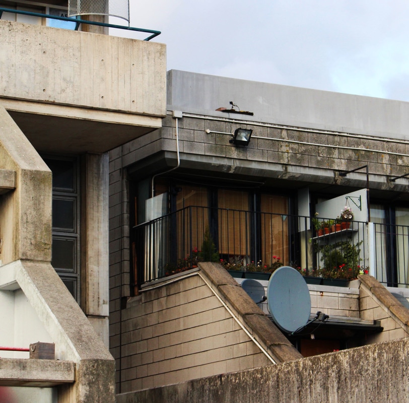
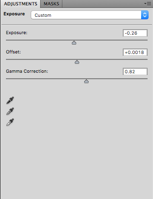
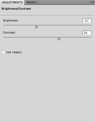
Original image
I adjusted the exposure to -0.26, offset to +0.0018, gamma correction to 0.82 Then I manually adjusted the brightness to -37 and increased contrast to 26 Lastly I cropped the image |
